


Outsource Annual Report Design: From Boring Data to Compelling Visuals
When you outsource annual report design, you free up your team to focus on what moves the needle.
📋 Table of Contents
Your Annual Report Probably Looks Like Garbage
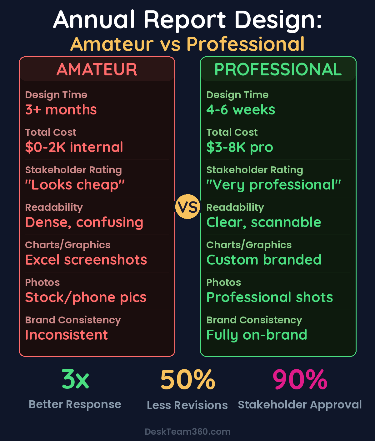
I need to say this upfront: most annual reports are painful to look at. Dense walls of text that nobody reads, stock photos that could be from any company anywhere, charts that look like someone’s nephew made them in PowerPoint, and layouts that scream “we don’t actually care how this looks.”
This matters more than you think. Your annual report isn’t just a compliance requirement or something to check off your end-of-year list. It’s how shareholders judge your competence, how donors decide whether to keep supporting you, and how potential partners evaluate whether you’re worth working with.
When your annual report looks amateur, everything else gets questioned. Doesn’t matter if you had a record-breaking year, the sloppy presentation makes people wonder what else you’re cutting corners on.
I’ve been helping organizations with their marketing and design for over 12 years, and I’ve watched companies spend months gathering incredible data and achievements, only to present them in a document that looks like it was thrown together over a weekend. The content is gold, the presentation is garbage, and guess which one people remember.
The fix isn’t hiring a full-time designer or learning InDesign yourself. It’s outsourcing to professionals who do this for a living and know how to make your numbers tell a compelling story.
Why Design Actually Matters for Annual Reports
Your annual report is competing for attention with every other piece of content your stakeholders see. Board members aren’t sitting in a quiet room with nothing else to do, carefully reading every word. They’re skimming while checking email, flipping through pages during meetings, looking for the key points that matter.
Good design makes those key points impossible to miss. When someone can glance at a page and immediately understand your biggest wins, that’s design doing its job. When they have to hunt through paragraphs of text to find your revenue growth, that’s design failing.
Think about who reads your annual report and what they need to walk away with. Investors want to see financial performance and strategic direction. Donors want proof their money made a difference. Employees want confirmation they’re working for a winner. Media wants quotable statistics and clear narratives.
The data visualization alone makes the design investment worthwhile. Financial statements and performance metrics are inherently boring to look at, but they don’t have to be. Custom charts that match your brand, infographics that distill complex information into scannable visuals, and timeline graphics that show clear progress over time transform numbers into stories.
When a board member can understand your key metrics in ten seconds instead of ten minutes, they’re more likely to approve budget increases and strategic initiatives. When donors can see exactly how their contributions created impact, they give more next year.
Free 5-Minute Video
See How DeskTeam360 Works in Under 5 Minutes
Watch the short video and see exactly how we handle design, development, and marketing implementation — so you don't have to.
Watch the Video →
Corporate vs Nonprofit Reports Need Different Approaches
I see organizations try to copy annual report templates from completely different sectors, and it never works. Corporate reports and nonprofit impact reports serve different purposes and need different design strategies.
Corporate annual reports focus on financial performance, strategic direction, and regulatory compliance. The audience is sophisticated investors and business stakeholders who understand financial statements and want transparency about risks and opportunities. The design needs to look professional and trustworthy, but it doesn’t need to be emotionally compelling.
Corporate reports typically run 40 to 100+ pages because they’re required to include detailed financial statements, governance information, and regulatory disclosures. The design challenge is organizing dense information hierarchically so readers can find what they need quickly.
Nonprofit impact reports serve a completely different function. They’re stewardship documents designed to inspire continued giving and show donors their money created real change. The focus is on mission impact, human stories, and emotional connection. Financial transparency matters, but it’s not the main event.
Nonprofits need their reports to inspire action, not just inform. The design should create emotional resonance through photography, testimonials, and visual storytelling that connects donors to the mission.
For more on this, check out our guide on outsource course creation and design: the complete production guide.
For a deeper dive, see our guide on how much does it cost to outsource marketing in 2026? (real numbers).
Nonprofit reports can be shorter, 12 to 30 pages, but they need to be more creative and engaging. Every page should reinforce why the organization matters and why continued support will create more impact.
What Actually Belongs in Your Annual Report
Most organizations include way too much content in their annual reports. Not every program needs a full page, not every metric deserves a chart, and not every staff member needs to be photographed. Edit ruthlessly.
For corporate reports, start with the letter from leadership explaining the year’s strategy, key achievements, and outlook for next year. Include a company overview for new stakeholders who might not know your full scope. Cover major business segments with specific performance data and growth metrics. Financial statements are required, but present them cleanly with visual hierarchy.
Don’t forget corporate governance information like board composition, committee structure, and key policies. Shareholders and regulatory bodies need this information, and good design makes it accessible instead of buried.
For nonprofit reports, lead with impact by the numbers in an infographic-style format. Donors want to see their contributions quantified immediately. Spotlight your key programs with real stories, real photos, and specific outcomes. Avoid generic descriptions, use concrete examples of people helped and problems solved.
Include donor recognition because acknowledging supporters encourages continued giving, but don’t let it dominate the document. Financial summaries should be visual and simplified, with detailed statements available separately for those who want them.
Why You Should Outsource Instead of DIY
Annual report design is a specialized skill that’s different from marketing design, web design, or even other print design. It requires expertise in multi-page layouts, data visualization, dense typography, and brand consistency across dozens of pages with varied content types.
Your marketing person who’s great at social media graphics probably hasn’t designed a 40-page document with complex financial charts. Your intern who knows Photoshop doesn’t understand print production requirements like bleed, trim, and color spaces.
Even if you have a designer on staff, annual reports are time-intensive projects that create bottlenecks. Content gathering, writing, review cycles, and approvals take months. Adding design to your internal team’s workload means everything else gets delayed or the annual report gets rushed.
Pro tip: Outsourcing creates parallel workflows where your team focuses on content while professionals handle visual execution. The timeline gets cut in half and the quality goes up significantly.
For a deeper dive, see our guide on how much does logo design cost? (from $5 fiverr to $50k agency).
Related: 10 Best Unlimited Graphic Design Services for 2026 (Honest Rankings).
The cost comparison makes outsourcing obvious. A senior designer who specializes in document design costs $70,000 to $100,000+ annually, plus benefits and equipment. You need that level of expertise for maybe six weeks out of the year. Outsourcing gives you access to specialist talent for a fraction of the cost.
Your Outsourcing Options Ranked by Value
Design agencies charge $5,000 to $30,000+ for annual report design, depending on page count and complexity. They provide full project management and multiple team members, but they’re expensive and potentially slow. Many agencies don’t understand your specific industry, so you end up educating them about your business before they can design effectively.
Freelance designers cost $2,000 to $10,000 and often work faster than agencies because there’s no committee decision-making. You get direct communication and personal attention. The downside is you’re managing the project yourself, and if your freelancer gets overwhelmed or unavailable, you’re stuck.
If you need help finding quality freelancers, our guide on how to hire a graphic designer covers the vetting process thoroughly.
Design subscription services are the option most organizations don’t consider but should. For $399 to $999 monthly, you get unlimited design requests including your annual report plus all the marketing design work you need throughout the year. If you already use a service for ongoing design needs, your annual report becomes just another project at no additional cost.
Organizations using design subscriptions complete annual reports 40% faster because the design team already knows their brand, voice, and preferences.
The turnaround is typically one to three business days per batch of pages, so you can iterate quickly and make changes without renegotiating project scope.
How to Set Up Your Designer for Success
The quality of your outsourced design depends entirely on the quality of your brief and materials. Designers aren’t mind readers, and they can’t fix unclear content with better fonts.
Finalize all written content before any design work starts. Changing copy after layout begins is expensive and time-consuming for everyone involved. Label all sections clearly with proper heading hierarchy so designers understand the content structure.
Provide all data in clean, organized spreadsheets, not screenshots or PDFs. Include notes about what data should be visualized and how. “Make this into a chart” isn’t helpful guidance. “Show the 40% revenue growth with a comparison to last year” gives designers what they need.
Brand assets matter more than you think. Provide logo files in vector format, complete brand color palettes with hex and CMYK codes, and font specifications. If you don’t have formal brand guidelines, create them before starting the annual report. Our guide on creating a brand style guide walks through the process step by step.
Watch out: Don’t provide 100 random photos and expect designers to choose. Curate your imagery carefully and provide final, approved photos at high resolution. “Can you Photoshop this blurry phone photo?” is not a design solution.
Include examples of annual reports you admire from other organizations. Visual references communicate your preferences better than written descriptions. If you want something “modern and clean,” show examples of what that means to you.
Timeline That Actually Works
Most organizations start their annual report process too late and then panic about deadlines. Plan backwards from your distribution date and build in buffer time for unexpected delays.
Start content gathering 8 to 12 weeks before your distribution deadline. Writing and photography should be completed 6 to 8 weeks before. Content needs to be completely finalized and handed off to designers 4 to 6 weeks before distribution.
The design phase itself takes 3 to 4 weeks for first proof delivery and feedback, 2 to 3 weeks for revisions, and 1 to 2 weeks for final approval and print preparation. This assumes normal complexity and reasonable stakeholder availability for approvals.
Don’t compress the design timeline to make up for late content. Rushed design looks rushed, and your stakeholders will notice. Better to distribute a week late with professional design than on time with amateur presentation.
Modern Design Trends Worth Considering
Interactive digital reports are becoming more common as organizations recognize that PDFs aren’t optimized for mobile viewing. Web-based reports with interactive charts, scroll-triggered animations, and video integration create more engaging experiences for stakeholders.
Minimalist layouts with bold typography focus attention on key messages instead of overwhelming readers with visual noise. Clean, spacious design makes dense information more approachable and professional-looking.
Data storytelling goes beyond traditional charts and tables to create narrative flow through visual information. Instead of dumping financial data into spreadsheets, modern reports guide readers through the story behind the numbers with annotations and context.
Photography-driven design, especially for nonprofits, creates emotional connection through real images of beneficiaries and programs. Stock photography signals that you don’t understand your own mission, while authentic photography demonstrates real impact.
Understanding how visual design affects engagement applies to print documents too. The same principles that keep website visitors engaged help annual report readers stay focused through your entire document.
Common Mistakes That Kill Annual Reports
Starting design before content is final creates endless revision cycles and frustrated designers. Lock down every word before layout begins, no exceptions.
Too many stakeholders in the review process slows everything down and dilutes the final product. Limit design approvals to two or three decision-makers maximum. Board committees can provide input on content, but they shouldn’t be approving design choices.
Trying to include everything results in unfocused documents where important information gets lost in the noise. Your annual report should highlight your biggest wins and most important metrics, not catalog every activity from the entire year.
Last-minute photography ruins even the best design. Plan photo shoots months in advance and budget properly for professional photography. Your annual report photos will be seen by your most important stakeholders, they need to look professional.
Make Your Annual Report Worth Reading
Your organization accomplished impressive things this year. Your annual report should reflect that level of professionalism and competence. Good design transforms achievement data into compelling narratives that stakeholders actually want to read and remember.
Don’t let amateur presentation undermine a year of solid performance. The difference between a document that gets skimmed and one that gets studied carefully is almost always the design quality.
Professional annual report design isn’t a luxury expense, it’s an investment in stakeholder confidence and continued support. When your report looks as impressive as your results, you get credit for both.
Free Tool
How Much Is Freelancer Management Really Costing You?
Most agency owners have never done this math. Plug in a few numbers and see your real cost in 2 minutes.
Calculate Your Hidden Costs →