
10 Things Your Small Business Website Needs to Wow Prospects
Your Website Is Your Best (or Worst) Sales Rep
Let’s talk about small business website essentials and why it matters for your business. Here’s the brutal truth: your website is making first impressions 24/7, whether you’re awake or asleep. And most small business websites are sabotaging themselves in ways that are completely preventable.
📋 Table of Contents
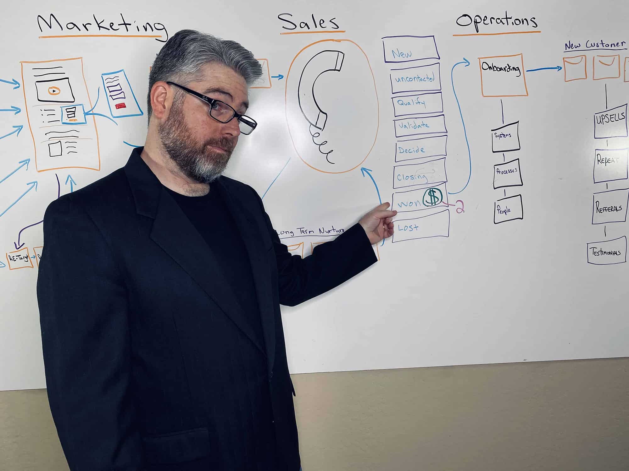
I’ve reviewed hundreds of small business websites over the past 12 years, from local service companies to e-commerce startups. The ones that wow prospects share ten specific elements. Miss any of them, and you’re handing potential customers to your competition.
Let me walk you through exactly what separates amateur-looking sites from ones that actually convert visitors into paying customers. These aren’t theoretical best practices. They’re proven patterns from real businesses that went from struggling online to closing deals from their website every week.
1. A Crystal-Clear Value Proposition Above the Fold
Your homepage has three seconds to communicate what you do and why it matters. That’s it. Three seconds before someone hits the back button and tries your competitor.
The best value propositions answer three questions instantly: what do you do, who do you do it for, and what specific result can people expect? “Web design services” isn’t a value proposition. “Custom websites that help local businesses get 3x more leads” is.
Pro tip: Test your value proposition with the five-year-old test. Could a five-year-old read your homepage and explain what your company does? If not, simplify it until they could.
Your value proposition needs to live above the fold, meaning visible without scrolling. Everything else is secondary. I’ve seen companies bury their core message three paragraphs down, then wonder why their bounce rate is 80%. Don’t make visitors work to understand what you offer.
Free Template
The Ultimate Task Delegation Template
Stop guessing what to hand off. This template shows you exactly what to delegate, how to brief it, and how to QA the results.
Get the Free Template →
2. Social Proof That Actually Means Something
Generic testimonials kill credibility faster than no testimonials at all. “Great service, highly recommended!” tells me nothing. What specific problem did you solve? What result did the customer get? How long did it take?
The most powerful social proof is specific, includes the customer’s full name and company, and focuses on measurable outcomes. “Jeremy at DeskTeam360 helped us reduce support costs by 40% in three months” beats “Great customer service!” every single time.
If you’re just starting and don’t have customer testimonials yet, use other forms of social proof. Industry certifications, years of experience, number of projects completed, media mentions. Something concrete that builds trust beyond your own claims about how amazing you are.
Websites with specific, results-focused testimonials see 34% higher conversion rates than those with generic praise.
3. A Mobile Experience That Doesn’t Suck
Over 60% of web traffic comes from mobile devices now. If your website looks broken on a phone, you’re literally turning away the majority of your potential customers.
Mobile-first design isn’t optional anymore, it’s table stakes. Your website needs to load in under three seconds on a mobile connection, text needs to be readable without zooming, buttons need to be finger-friendly, and forms need to work without frustrating people into giving up.
I still see small business websites where you have to pinch and zoom to read anything, or where the contact form is unusable on mobile. That’s not quirky, it’s unprofessional. Fix it or lose the business.
4. Navigation That Makes Sense to Humans
Your website navigation should follow the “grandmother test.” Could your grandmother find what she’s looking for in two clicks? If your menu has seven main categories with dropdowns that have subcategories with more dropdowns, you’ve already lost.
The best small business websites stick to five or fewer main navigation items: Home, About, Services (or Products), Blog, Contact. Everything else goes in the footer or gets combined into broader categories.
Your navigation labels should use words your customers actually use, not internal jargon. “Solutions” means nothing. “Marketing Services” is clear. “Capabilities” is corporate nonsense. “What We Do” works for everyone.
Watch out: Dropdown menus that require precise mouse movements to access are usability nightmares. If someone can’t hover over your menu without it disappearing, they’ll go somewhere else.
5. Contact Information That Builds Trust
Nothing screams “amateur operation” like hiding your contact information. Your phone number, email address, and physical address (if applicable) should be easy to find. Footer minimum, header even better.
Including a photo of your team or yourself humanizes your business. People buy from people, not faceless corporations. Even if you’re a one-person operation, showing your face builds trust faster than any stock photo of a handshake ever will.
If you work locally, make your location obvious. “Serving the Greater Atlanta Area” is much more compelling to Atlanta prospects than “Nationwide Service.” Geographic specificity builds trust and helps with local search rankings.
6. Page Speed That Doesn’t Test Patience
Slow websites don’t just annoy visitors, they kill conversions. A two-second delay in loading time increases bounce rates by over 100%. Amazon found that every 100ms of additional load time costs them 1% in sales.
Your website needs to load in under three seconds, preferably under two. Run your homepage through Google PageSpeed Insights. If you’re scoring below 85, you have work to do.
The biggest culprits are usually massive image files, bloated code, and cheap hosting. Compress your images, clean up your code, and invest in quality hosting. The performance improvement pays for itself in higher conversion rates.
Speed is a competitive advantage. While your competitors are loading their 5MB homepage, your 500KB site has already shown the value proposition and started building trust. That head start matters more than you think.
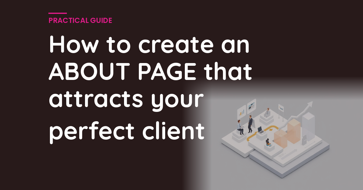
7. An About Page That Actually Sells
Most About pages are vanity projects that no prospect cares about. “Founded in 2015 with a passion for excellence” tells me nothing about whether you can solve my problem.
Your About page should answer why prospects should trust you with their business. What specific experience do you have? What results have you delivered for others? What makes you different from the fifteen other companies that do similar things?
Tell the story of why you started your business, but make it customer-focused. Don’t talk about your journey of self-discovery. Talk about the problem you kept seeing in your industry and how you decided to fix it. That story resonates with prospects facing the same problem.
Our guide on creating FAQ pages covers similar principles for addressing customer concerns proactively. The About page is your chance to address the question “Why should I trust these people?” before it even gets asked.
8. Service Pages That Close Deals
Generic service descriptions don’t sell anything. “We provide quality marketing services” could apply to any marketing agency on earth. Your service pages need to be specific about what you do, how you do it, and what results customers can expect.
Each service page should follow a proven structure: lead with the specific problem you solve, explain your approach or process, provide concrete examples of results you’ve delivered, address common objections or concerns, and end with a clear next step.
Include pricing ranges if possible. Yes, this will scare away some prospects who can’t afford you. That’s the point. You want to attract qualified leads and repel the wrong ones. Being upfront about pricing saves everyone time and positions you as transparent.
For businesses offering multiple services, understanding how to measure ROI helps you articulate the value of each service in concrete terms that matter to customers.
9. Forms That Don’t Require a Law Degree
Long contact forms are conversion killers. Every additional field you require reduces form completions. The best contact forms ask for three things: name, email, and message. That’s it.
If you need more information to provide accurate quotes, ask for the basics in the form and gather details during the follow-up conversation. Getting the initial contact is more important than perfect qualification upfront.
Your form should work perfectly on mobile devices. Test it yourself on your phone. If anything is frustrating about the experience, fix it. Every friction point costs you leads.
10. Clear Calls to Action Throughout
Every page on your website should have a clear next step for interested prospects. Not buried in the footer, not hidden in a paragraph of text. Front and center with action-oriented language.
“Contact us to learn more” is weak. “Get your free quote in 24 hours” is specific and compelling. “Schedule a 15-minute strategy call” gives people a concrete next step. “Download our pricing guide” provides immediate value.
Your calls to action should appear multiple times throughout longer pages. Someone might be ready to take action after reading your credentials, or after seeing your testimonials, or after understanding your process. Give them the opportunity whenever they’re ready.
For industry research and benchmarks, check out Google’s web.dev.
Color contrast matters for calls to action. Your main CTA button should stand out from everything else on the page. If someone squints at your homepage and can’t immediately spot how to contact you, your button isn’t prominent enough.
For more insights on optimizing your online presence, check out our article on reducing website bounce rates to keep more visitors engaged with your content.
The Secret Sauce: It All Works Together
Here’s what most small business owners miss: these elements don’t work in isolation. A great value proposition with terrible mobile experience still fails. Perfect navigation with no social proof still leaves prospects skeptical. Fast loading with unclear calls to action still doesn’t generate leads.
The websites that wow prospects nail all ten elements. They load fast, look professional on every device, communicate value clearly, build trust with specific social proof, and make it easy for interested prospects to take the next step.

This isn’t about having the flashiest design or the most expensive development budget. It’s about understanding what prospects need to feel confident choosing your business over the alternatives. Most small business websites fail because they focus on what the business owner wants to say instead of what prospects need to hear.
Pro tip: Audit your website against these ten criteria monthly. Markets change, customer expectations evolve, and your competitors improve their sites. What impressed prospects last year might be table stakes today.
The businesses that understand this and implement it consistently are the ones that grow. Their websites become lead generation machines instead of digital brochures. They capture prospects who might otherwise go to competitors with better online experiences.
Your Website Should Work as Hard as You Do
Your website is working 24/7, whether you’re paying attention or not. Every visitor is forming an opinion about your business based on those ten elements. Every prospect is deciding whether you look professional enough to trust with their project.
The good news is that fixing these issues isn’t rocket science. It takes focused effort and attention to detail, but every element I’ve covered is completely within reach for any small business owner who’s willing to prioritize their online presence.
At DeskTeam360, we’ve helped 400+ clients build websites that wow prospects and generate consistent leads. We handle everything from strategy to design to optimization, so you can focus on running your business instead of wrestling with website technicalities.
Understanding optimization principles for digital platforms can help you apply similar thinking to your website performance.
Your competitors are already working on this. The question isn’t whether you need a website that wows prospects. The question is whether you’ll implement these changes before they steal your customers, or after they already have.
Free 5-Minute Video
See How DeskTeam360 Works in Under 5 Minutes
Watch the short video and see exactly how we handle design, development, and marketing implementation — so you don't have to.
Watch the Video →