


Outsource App Store Screenshot Design: The Complete Guide
When you outsource app store screenshot design, you free up your team to focus on what moves the needle.
📋 Table of Contents
Your App Store Screenshots Are Killing Your Downloads
I’m going to tell you something that might hurt. Your app could be perfect, your features could solve real problems, your UI could be gorgeous. But if your screenshots suck, nobody’s downloading it. Period.
Here’s the brutal math: 70% of people decide whether to download your app based on the first three screenshots they see. They don’t read your description. They don’t watch your preview video. They look at screenshots one, two, and three, and they’re done. Either they tap “Get” or they keep scrolling.
I’ve watched developers spend six months building incredible apps, then slap together screenshots in 20 minutes using the default iPhone frame template they found on some design blog. Then they wonder why their downloads are flat and their ASO rankings never improve. Your screenshots aren’t just images, they’re your entire sales pitch compressed into 10 frames.
The Real Cost of Bad Screenshots
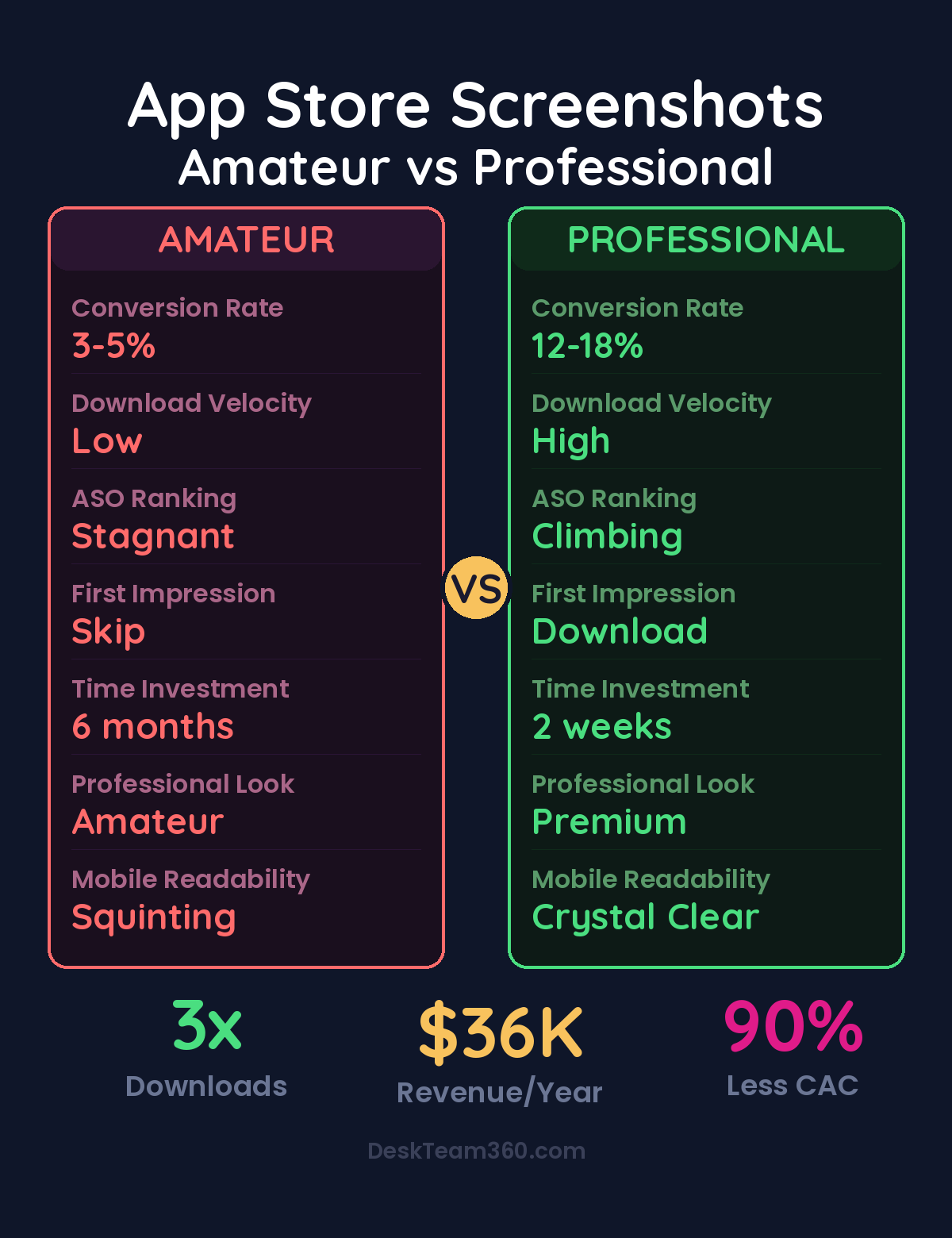
Let me paint a picture of what bad screenshots actually cost you. Your app gets 1,000 impressions in the App Store this week. With professional screenshots, you might convert 15-20% of those into downloads. That’s 150-200 new users. With amateur screenshots, you’re lucky to hit 3-5%. That’s 30-50 downloads for the same visibility.
If outsource app store screenshot design is on your radar, this guide is for you. When you outsource app store screenshot design, you’re making a strategic move. Upgrading your screenshots could 3x your conversion rate overnight. Same traffic, same rankings, triple the downloads.
But here’s where it gets expensive. App Store algorithms factor download velocity into rankings. Better screenshots drive more downloads, which signals to Apple and Google that your app is worth showing to more people. More visibility means more downloads, which improves rankings further. It’s compound growth, and it starts with those first three screenshots.
The flip side is compound failure. Bad screenshots mean low conversion rates, which signal low engagement to the algorithms, which means less visibility, fewer downloads, and worse rankings. You’re stuck in a downward spiral that has nothing to do with your actual product quality.
Free Tool
How Much Is Freelancer Management Really Costing You?
Most agency owners have never done this math. Plug in a few numbers and see your real cost in 2 minutes.
Calculate Your Hidden Costs →
Platform Differences That Actually Matter
Apple and Google approach screenshots differently, and designing the same set for both platforms is a mistake I see constantly.
Apple’s App Store feels premium and editorial. Users expect clean designs, subtle branding, and plenty of white space. Think magazine spreads, not sales brochures. You get 10 screenshots maximum, and the first three are visible without scrolling. Device frames work well here because they create that polished, professional look Apple users expect.
Google Play is more functional and direct. Users are comfortable with bold text, feature callouts, and comparison-style layouts. You only get 8 screenshots total, and the first one appears in search results, making it your highest-impact design opportunity. Skip the device frames if your UI is clear without them.
Pro tip: Design separate screenshot sets for each platform. What converts on Apple often flops on Google Play, and vice versa. The extra work pays for itself in higher conversion rates.
For more on this, check out our guide on outsource course creation and design: the complete production guide.
For a deeper dive, see our guide on how to create a brand identity from scratch (complete guide + costs).
The Screenshot Sequence That Converts
Your screenshots need to tell a story, and that story needs to hook viewers immediately. Here’s the sequence that works across industries and app types.
Screenshot one is your value proposition. Not your feature list, your benefit. “Get organized in minutes” not “Advanced task management features.” This screenshot determines whether people look further, so pour 50% of your design effort here. Make the benefit huge, make it clear, and make it specific.
Screenshots two through four showcase your core features, but frame them as outcomes, not functions. “Never miss a deadline” showing your notification system. “See your progress at a glance” showing your dashboard. “Work anywhere” showing offline functionality. Each screenshot should make the viewer think “I need that.”
Screenshots five and six are your social proof moment. Show user counts, ratings, press mentions, or before-and-after results. “Trusted by 100,000+ professionals” or “Users save 5 hours per week on average.” Real numbers beat vague claims every time.
The final screenshots cover secondary features and your call to action. These matter less for conversion, but they help qualified users understand the full scope of what you’re offering. End with something like “Start your free trial today” or “Join 1 million users worldwide.”
Why Professional Design Actually Matters
App store screenshot design is specialized. It’s not just graphic design, it’s graphic design optimized for tiny screens, combined with copywriting, mobile UI knowledge, and ASO expertise. Most developers don’t have these skills, and honestly, most general graphic designers don’t either.
A professional screenshot designer understands that text readable at desktop size becomes illegible at thumbnail size. They know which device frames look current and which look dated. They understand platform-specific conventions and can write benefit-focused copy that converts.
What does this cost? Freelance screenshot design runs $500 to $3,000 per platform, depending on complexity and designer experience. ASO-focused agencies charge $2,000 to $10,000 for comprehensive screenshot optimization. If you’re already working with a design team, add screenshot optimization to your regular requests rather than treating it as a separate project. Understanding how to budget for design work helps you plan these investments effectively.
Testing What Actually Works
Both Apple and Google offer built-in A/B testing tools, and not using them is leaving money on the table. Apple’s Product Page Optimization lets you test up to three different screenshot sets with automated traffic splitting. Google Play Store Listing Experiments work similarly.
Test headline copy first. The same feature can be positioned dozens of ways, “Advanced filtering” versus “Find anything instantly” versus “Never lose track again.” Small copy changes often produce massive conversion differences.
Screenshot order matters too. Which feature converts better as your lead story? Social proof upfront or at the end? Device frames or full-bleed designs? Background colors that match your brand versus colors that create contrast? The only way to know is to test.
Watch out: Run tests for at least seven days with meaningful traffic before declaring a winner. Small sample sizes and short test periods produce unreliable results that lead to bad decisions.
Related reading: Outsource Annual Report Design: From Boring Data to Compelling Visuals.
For more on this, check out our guide on what is white label marketing? the complete guide for agencies.
Related reading: Outsource Pitch Deck Design: Investor and Sales Decks That Win.
For industry research and benchmarks, check out Clutch.co.
For industry benchmarks and research, see HBR on Outsourcing.
Localization: The Hidden Conversion Multiplier
If your app is available internationally, English screenshots in non-English markets are conversion killers. Localization can double or triple download rates in international markets, but most developers skip it because it feels complicated.
Here’s what localization actually involves. Translate your headline text for every screenshot. Show your app UI running in the local language. Adapt cultural references and color choices that resonate locally. Account for text length differences because German and French text runs 20-30% longer than English equivalents.
Prioritize your highest revenue markets first: United States, Japan, United Kingdom, Germany, China (Android only), South Korea, France, Canada, and Australia. Even localizing for your top three to five markets produces measurable download increases that justify the investment.
Common Mistakes That Tank Conversions
Too much text is the most common screenshot killer. If your headline needs two lines, it’s too long. Remember, people see these at thumbnail size first. Keep headlines to five words maximum.
Showing empty states makes your app look useless. Don’t screenshot your onboarding flow or empty dashboards. Use realistic sample data that makes your app look active and valuable. Show the aspirational version of what users will create.
Inconsistent design language across screenshots signals amateur work. Use the same fonts, colors, layout structure, and device frames throughout your set. Your screenshots should feel like pages from the same design system.
Device frame selection matters more than you think. Using iPhone 8 frames in 2026 signals “abandoned app” to users. Current generation frames (iPhone 15, Pixel 8) make your app feel modern and maintained.
Ignoring your first screenshot is guaranteed conversion suicide. This is your storefront window, your billboard, your elevator pitch. Spend 50% of your design time here. Make it impossible to ignore and irresistible to tap.
Briefing Your Designer for Success
Whether you hire a freelancer, work with an agency, or use a design service, the quality of your brief determines the quality of your results. Provide actual app screenshots or screen recordings showing real UI, not mockups or wireframes. Include complete brand guidelines with logo files, color codes, and any font requirements.
Describe your target audience specifically. “Small business owners who manage teams” not “business users.” List your top three to five features ranked by importance to your users, not by development complexity. Share competitor screenshots so your designer understands the competitive landscape and can differentiate your approach.
Include platform requirements upfront. Which device sizes do you need? Are you planning localization? Do you need separate sets for Apple and Google? Clear requirements prevent expensive revision rounds later. Our comprehensive guide on writing effective creative briefs applies perfectly to screenshot projects.
The Economics of Professional Screenshots
Let’s do the math on professional screenshot investment. Your app gets 10,000 monthly impressions across app stores. Amateur screenshots convert 3%, generating 300 downloads. Professional screenshots convert 12%, generating 1,200 downloads. That’s 900 additional downloads per month.
If your app monetizes at $2 per user (conservative for most successful apps), professional screenshots generate an additional $1,800 in monthly revenue. Over a year, that’s $21,600 in additional revenue from a $2,000 to $5,000 screenshot investment.
But that math ignores the compounding effect. Higher conversion rates improve your rankings, which increases impressions, which drives more downloads, which improves rankings further. The real revenue impact could be 3x to 5x the direct conversion improvement.
Factor in reduced customer acquisition costs too. Better organic conversion means less dependency on paid user acquisition, which saves money on every download. If you’re spending $5 per download on Apple Search Ads, converting more organic traffic directly improves your unit economics. For more insights on optimizing marketing budgets, check our marketing ROI calculation guide.
Stop Treating Screenshots as an Afterthought
Your app store screenshots are your most important marketing asset. They determine first impressions, drive conversion rates, influence algorithmic rankings, and shape user expectations before anyone opens your app.
Most developers treat them as the last step before launch, something to rush through so they can submit to the App Store. That’s backwards thinking. Your screenshots deserve the same attention as your core features because they determine whether anyone discovers those features exist.
Invest in professional design. Write benefit-focused copy. Follow platform-specific best practices. Test relentlessly. Localize for key markets. Treat your screenshots as the sales tool they actually are.
Need professional screenshot design handled alongside all your other design and development work? DeskTeam360 manages screenshot optimization as part of our comprehensive design services. Submit your app store project with your web design, marketing materials, and everything else. One subscription, professional results across everything.
Free 5-Minute Video
See How DeskTeam360 Works in Under 5 Minutes
Watch the short video and see exactly how we handle design, development, and marketing implementation — so you don't have to.
Watch the Video →