

How to Create a High-Converting Course Sales Page
Let’s talk about course sales page design and why it matters for your business.
📋 Table of Contents
Why Most Course Sales Pages Fail Before Anyone Reads Them
You spent six months creating your course. Recorded hours of content. Built worksheets, templates, bonus materials. Then you slapped together a sales page in two days and wonder why it’s not converting. I see this constantly, and it’s completely backwards.
Your course is only as valuable as your ability to sell it. I don’t care if you’ve cracked the code to making millions online, if your sales page looks like a 2010 ClickFunnels template and reads like ChatGPT wrote it, you’re leaving massive money on the table.
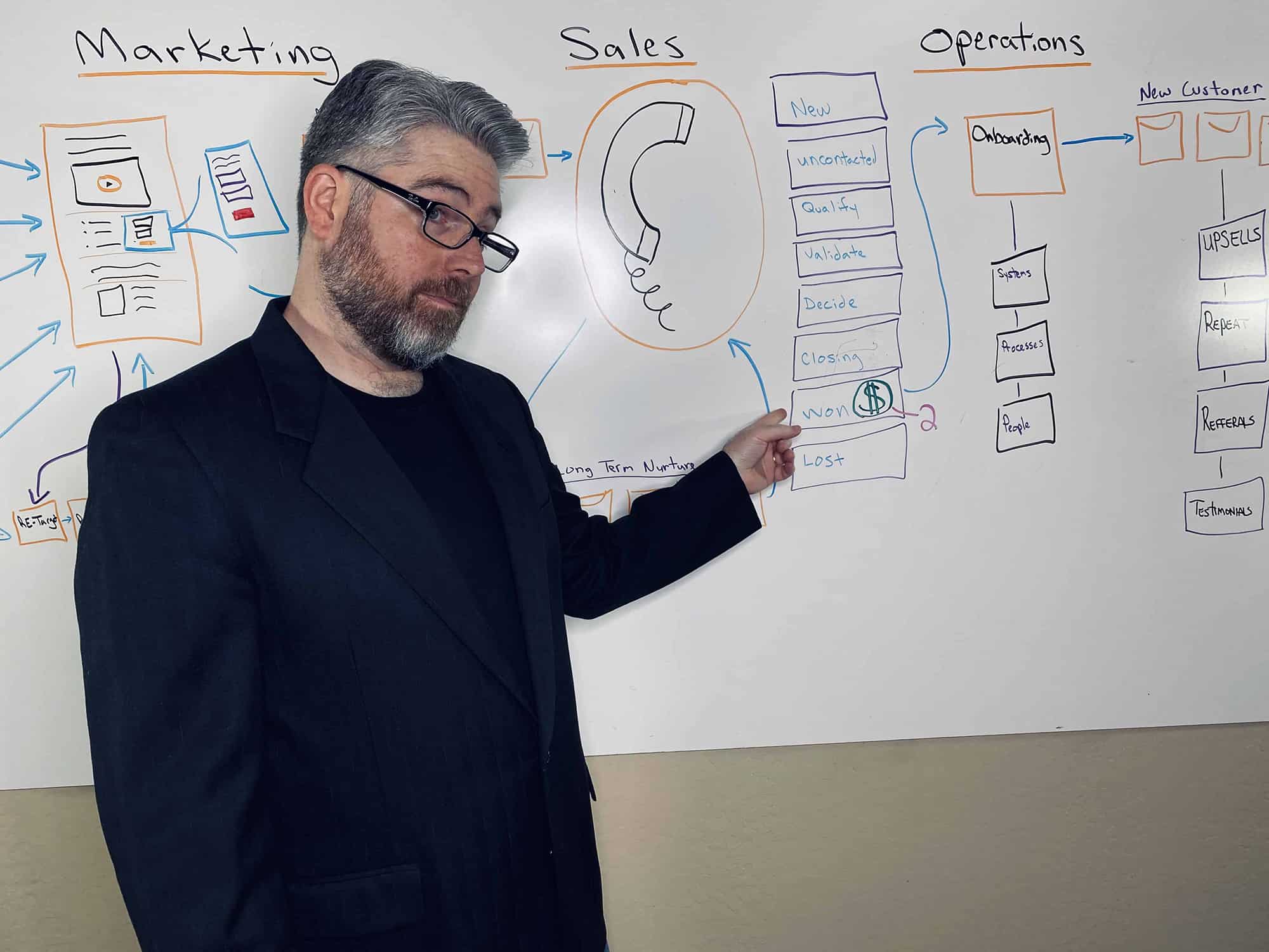
I’ve been running DeskTeam360 for over 12 years, and we’ve designed sales pages for course creators at every level. From first-time launchers barely scraping together their course content to seven-figure creators with massive launches. The difference between a page that converts at 1% and one that converts at 8% isn’t luck or traffic quality. It’s understanding psychology, structure, and design working together to eliminate every barrier between “maybe” and “sold.”
Let me show you exactly how to create a course sales page that actually converts. No theory, just the playbook that’s generated millions for our clients.
Stop Obsessing Over Page Length and Focus on What Actually Matters
The first question every course creator asks is “should my sales page be long or short?” That’s like asking “should my car be red or blue?” without knowing if you need a pickup truck or a sports car. The format follows the function.
Here’s when you need a long-form sales page and when you don’t. If your course costs more than $300, you’re selling to cold traffic, or your audience needs significant education about the problem you solve, go long. We’re talking 3,000 to 5,000 words minimum. High-ticket purchases require trust, and trust requires information. Every section you add addresses another objection and moves prospects closer to “yes.”
Short pages work when you’re selling to warm audiences who already know and trust you, your course is under $200, or the offer is dead simple to understand. But here’s the thing, most course creators should default to long-form. You can always shorten based on data, but you can’t overcome objections you never addressed.
Free 5-Minute Video
See How DeskTeam360 Works in Under 5 Minutes
Watch the short video and see exactly how we handle design, development, and marketing implementation — so you don't have to.
Watch the Video →
The Anatomy of a Sales Page That Actually Sells
Here’s the exact structure that works, tested across hundreds of launches. Miss any of these sections and you’re giving prospects an excuse to leave.
The hero section is your make-or-break moment. You get three seconds to convince someone to keep scrolling, and most course creators blow it by leading with features instead of transformation. Your pre-headline qualifies the visitor, like “For coaches and consultants who want to scale without burning out.” Your main headline states the specific result they’ll get, not what your course covers. “How to Book 20 Discovery Calls Per Week Using LinkedIn” beats “The Complete LinkedIn Course” every single time.
Include a subheadline that adds specifics, a professional course mockup or short video, your primary CTA button above the fold, and some form of social proof. “Join 3,200+ students” or a powerful one-line testimonial. This section determines whether people bounce or engage, so invest the time to get it right.
Next comes the problem section, and this is where most course creators get squeamish. They think highlighting pain is manipulative. Wrong. It’s empathy at scale. Before people will buy your solution, they need to feel the cost of staying where they are.
Paint a vivid picture of their current reality. What are they struggling with right now? What have they already tried that failed? What’s the real cost of inaction, not just in money but in time, opportunity, and stress? Use the exact language your ideal students use. If you’ve done discovery calls, pull phrases directly from those conversations.
Pro tip: The problem section should make your ideal prospect think “holy crap, they’re talking directly to me.” If someone reads your problem description and thinks “yeah, that’s someone else’s situation,” you’re targeting too broadly.
Now introduce your solution, but not by listing features. Focus purely on transformation. What does their life look like after completing your course? What specific outcomes can they expect? How is your approach different from everything else they’ve tried? This is where you name your methodology. “The Authority Accelerator Framework” or “The 90-Day Revenue Sprint System.” Give your approach a branded name that feels proprietary and proven.
The curriculum breakdown shows them what’s inside, but frame every module in terms of outcomes, not topics. “Module 3: Building Your Content Machine” is infinitely better than “Module 3: Content Marketing.” Show the specific lessons, include bonuses like templates or resources, and end each module description with “By the end of this module, you’ll have…” followed by a concrete result.
Use expandable sections for the curriculum. This keeps the page scannable for skimmers while allowing detail-oriented prospects to dive deeper. Both personality types can find what they need without compromising the experience for either.
Social Proof Is Your Secret Weapon
Testimonials do more selling than your copy ever will. But most course creators treat them as an afterthought, dumping a few quotes at the bottom of their page and calling it good. That’s amateur hour.
You need transformation testimonials that show before and after with specific results. Objection-handling testimonials that start with “I was skeptical about…” and end with success. Relatable testimonials from students who mirror your target audience. Video testimonials, even casual ones shot on a phone, outperform written quotes by massive margins.
Here’s the strategy nobody talks about: sprinkle testimonials throughout your entire page. After the problem section, after the curriculum, after the pricing, near every CTA button. The best-converting sales pages have 10 to 15 testimonials woven throughout. Each one addresses a different concern or highlights a different result.
Quality beats quantity every time. One testimonial that shows a specific, measurable result from someone your prospects can relate to is worth more than ten generic “this course was great” quotes. Get specific or don’t bother.
Related: Outsource Pitch Deck Design: Investor and Sales Decks That Win.
For a deeper dive, see our guide on how to create an ai-powered customer support system.
The instructor credibility section answers “why should I learn this from you?” This isn’t your autobiography. Include relevant experience and results, the number of students you’ve served, any notable media or speaking engagements, a professional photo, and one personal detail that makes you relatable. Keep it focused and results-driven.
Your bonus stack increases perceived value and makes the price feel like a steal. Effective bonuses include templates and swipe files they can use immediately, bonus training that complements the core curriculum, community access for networking and support, live Q&A calls for personalized help, and software trials or discounts through partnerships.
Display each bonus with a realistic perceived value. “$297 Value, Included Free” makes the overall offer feel like a no-brainer, but inflated values destroy trust faster than you can rebuild it. Be honest about what each piece is worth.
Pricing Psychology That Converts
Present your pricing clearly and confidently. If you’re offering multiple options, structure them strategically. A payment plan lowers the initial barrier with three to six monthly installments. Pay in full should offer a slight discount for upfront payment. A premium tier adds one-on-one coaching or exclusive bonuses for a higher price point.
Design your pricing section to highlight your recommended option using visual hierarchy. The recommended plan gets the most prominent design treatment, usually the middle tier. Always stack the value above the price. “Total value: $2,497, Your investment: $997.” This reframes the price as a deal, not a cost.
Your guarantee eliminates the final barrier to purchase. A 30-day money-back guarantee is the standard and it works. A conditional guarantee like “complete all modules and if you don’t see results, full refund” protects against tire-kickers while still reducing risk. A results guarantee that says “if you don’t achieve this specific outcome, I’ll work with you until you do” is the most powerful but only offer it if you’re confident in your ability to deliver.
Design your guarantee section with a badge or seal graphic. This visual element communicates trust at a glance, even for people who don’t read the details.
Watch out: Don’t hide your guarantee in small text or bury it at the bottom. Make it prominent and easy to find. A hidden guarantee feels like you don’t believe in your own product.
The FAQ section addresses every remaining objection. How much time do I need to commit? What if I’ve tried other courses and they didn’t work? Is this right for my specific situation? How long do I have access? What if I need help along the way? Can I get a refund?
Each FAQ answer should end by reinforcing value or restating the guarantee. Don’t just answer the question, use it as another opportunity to sell. Turn objections into selling points.
Design Principles That Actually Matter
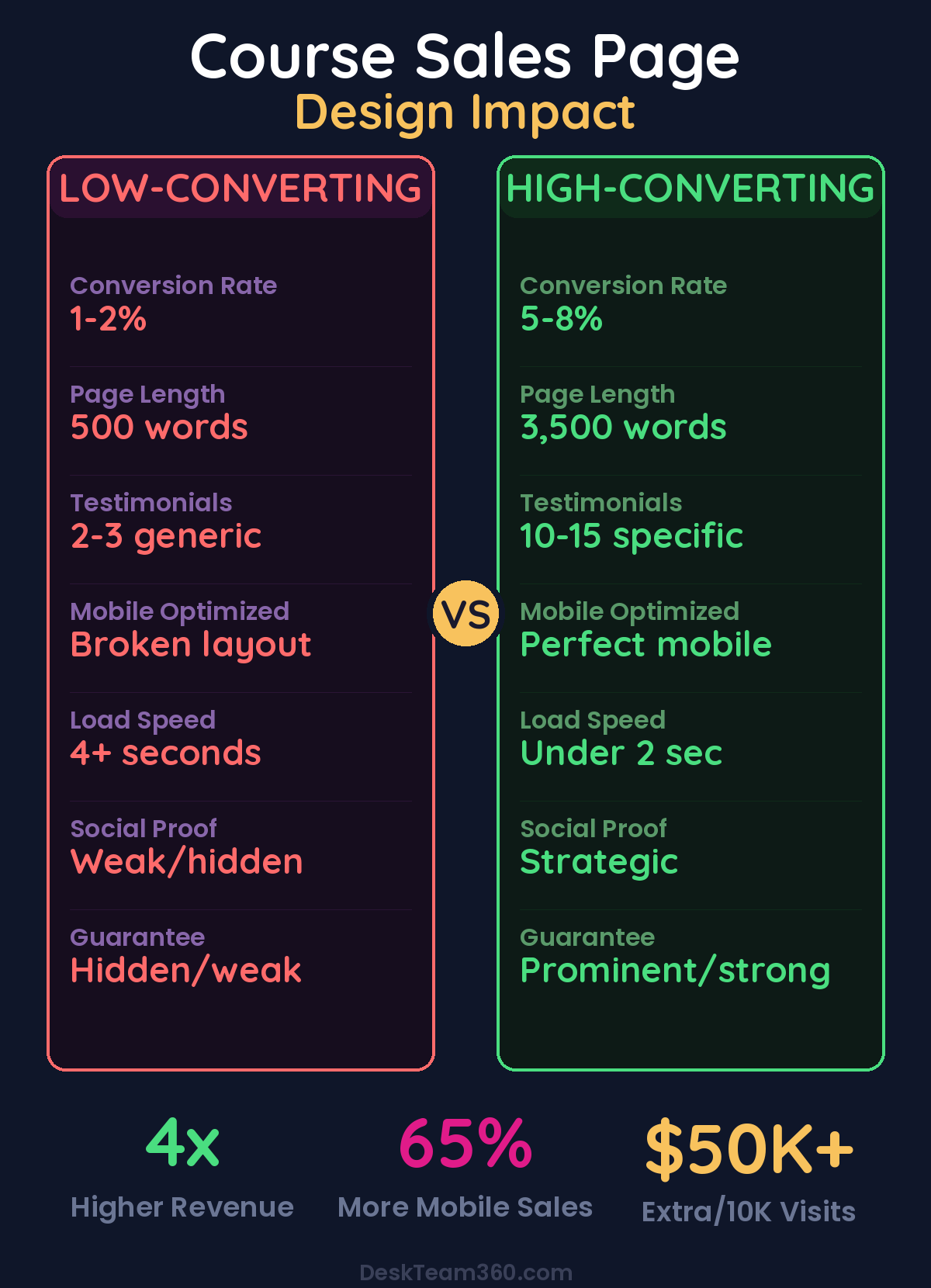
Here’s what kills me about course sales pages. Creators will spend weeks perfecting their video content but throw their sales page together with a free template in one afternoon. Your sales page is your highest-impact business asset. A 1% improvement in conversion rate on a page getting 10,000 visitors at $500 per course is an extra $50,000 in revenue. That’s not a rounding error.
Mobile optimization isn’t optional anymore. 65% of your traffic comes from phones, and if your page doesn’t look perfect on mobile, you’re losing the majority of potential buyers. Your CTA buttons need to be full-width and easy to tap. Text needs to be large enough to read without zooming, 16px minimum. Images must resize properly. Videos need to play on mobile. Testimonials can’t break your layout.
Visual hierarchy guides the eye and eliminates confusion. Use plenty of white space between sections. Clear headings and subheadings that create a logical flow. Consistent color palette, limit yourself to three or four colors maximum. One or two fonts, no more. Strategic use of bold and highlighting to emphasize key phrases, but don’t highlight everything or you highlight nothing.
Page speed kills conversions harder than bad copy. Every second of load time costs you sales. Our guide on speeding up your website covers the complete technical checklist. But here’s the short version: optimize your images, minimize scripts, and test your page speed before you launch. A slow page is a broken page.
Video Sales Letters for Personal Brands
Video sales letters work especially well for coaches and consultants whose personality is their brand, complex offers that need visual explanation, audiences that prefer watching over reading, and warm traffic from social media or YouTube.
A strong VSL follows the same structure as a written sales page: problem, solution, proof, offer, guarantee, call to action. The difference is you’re delivering it face-to-face on camera, which builds trust faster than text ever could.
Design a hybrid page that features the VSL at the top with written content below. This captures both audiences and maximizes conversions. Video people watch, text people read, everyone buys.
Hybrid pages with video and text convert 35% higher than video-only or text-only formats. Give prospects multiple ways to consume your message.
Test, Measure, and Optimize After Launch
Your first version won’t be your best version, and anyone who tells you otherwise is selling something. Plan to test and iterate continuously.
Test your headlines first. Three to five different headlines can show dramatically different conversion rates. “How to Book 20 Discovery Calls Per Week” might outperform “The Complete LinkedIn Lead Generation Course” by 40%. Test CTA copy. “Enroll Now” vs “Start Learning Today” vs “Join the Program” can each resonate differently with your audience.
Test price presentation. Monthly vs annual pricing, with and without comparison options. Move your strongest testimonials around and measure the impact. Use heat mapping tools like Hotjar or Microsoft Clarity to see where visitors engage and where they drop off.
This data is gold for optimization. If analytics show people consistently skip a section, test removing it. If they spend a lot of time on testimonials, add more. Let behavior guide your decisions, not hunches.
Stop Trying to DIY Your Sales Page
Here’s the brutal truth. Your sales page is the single highest-impact asset in your entire course business. It’s the bridge between all your marketing efforts and actual revenue. A professionally designed page that converts at 5% instead of 2% doesn’t just double your sales, it changes your entire business trajectory.
This isn’t the place to fight with your page builder for three days or use a free template that looks like everyone else’s. Professional design with proper visual hierarchy, mobile optimization, and conversion-focused layout pays for itself many times over.
At DeskTeam360, we’ve designed sales pages for course creators doing everything from $50K to $5M in annual revenue. We understand what converts because we’ve built hundreds of them and tracked the results. We handle the design so you can focus on creating great courses and marketing them effectively.
Build a Sales Page That Matches Your Course Quality
Stop losing sales to a page that doesn’t do your course justice. You’ve put the work into creating transformation for your students. Now create a sales page that actually sells that transformation to the people who need it most.
Whether you need a complete sales page design, landing page optimization, or a full sales funnel, our team can handle it for one flat monthly rate. No project fees, no surprise costs, just predictable pricing for predictable results. Learn more about our approach to professional landing page design and see how a dedicated creative team can transform your conversion rates.
Check out our complete funnel building services to see how we help course creators design entire customer journeys that convert prospects into students, then students into advocates.
Free Tool
How Much Is Freelancer Management Really Costing You?
Most agency owners have never done this math. Plug in a few numbers and see your real cost in 2 minutes.
Calculate Your Hidden Costs →