


How to Create a 404 Error Page That Keeps Visitors on Your Site
Why Your Default 404 Page Is Bleeding Revenue
Let’s talk about custom 404 error page. Here’s something most business owners never think about: every single day, people land on broken pages on your website. Maybe they clicked an old link from Google. Maybe they mistyped your URL. Maybe you deleted a page six months ago and forgot to redirect it.
📋 Table of Contents
What happens next determines whether that visitor becomes a customer or disappears forever.
If you’re running the default 404 page, you know, that soul-crushing “Page Not Found” message that looks like it was designed by someone who actively hates visitors, you’re losing potential customers every single day.
After 12 years of building and managing websites for 400+ clients, I can tell you that a custom 404 page is one of the highest-ROI changes you can make. It takes maybe two hours to set up correctly, and it can recover visitors who would otherwise bounce instantly.
Let me show you exactly how to build one that actually works.
What a 404 Error Page Actually Is (And Why It Matters)
A 404 error occurs when someone tries to access a page on your website that doesn’t exist. The server literally can’t find what they’re looking for, so it serves up an error page instead.
Every website has one. The question is whether yours is the default disaster or something intentionally designed to help visitors find what they need.
Here’s what triggers most 404 errors: broken external links where other websites are linking to pages you’ve since removed or renamed, typos in the URL when someone manually types your address and misspells something, deleted or moved content where you restructured your site but didn’t set up proper redirects, old bookmarks from visitors who saved a page that no longer exists, and search engine crawling errors when Google tries to index pages that have been removed.
The point is simple. 404 errors are inevitable. You can’t prevent them entirely. But you can absolutely control what happens when they occur.
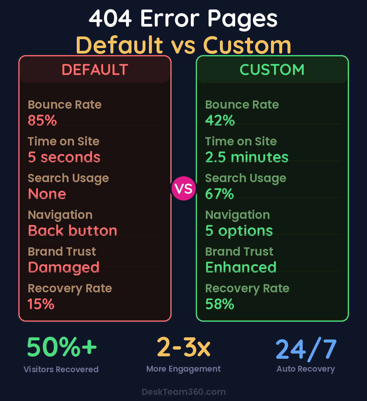
The average website visitor who hits a default 404 page has an 85% bounce rate. That’s almost everyone leaving immediately.
Free Template
The Ultimate Task Delegation Template
Stop guessing what to hand off. This template shows you exactly what to delegate, how to brief it, and how to QA the results.
Get the Free Template →
Why the Default 404 Page Fails So Spectacularly
Most default 404 pages have three things in common: they’re ugly, they’re unhelpful, and they make visitors feel like they’ve hit a dead end with no escape route.
Think about it from the visitor’s perspective. They were looking for something specific. They clicked a link expecting to find your pricing page or that blog post about customer service automation. Instead, they get a stark white page that basically says “Nope, nothing here. Good luck figuring out what to do next.”
What do most people do? They hit the back button and go somewhere else. Usually to a competitor.
I’ve tracked this across dozens of client websites. Visitors who hit a default 404 page have bounce rates above 85%. A well-designed custom 404 page can cut that bounce rate dramatically, often recovering 30-50% of those lost visitors by giving them a clear path forward instead of a dead end.
The companies that get this right understand something crucial: a 404 error is an opportunity, not just a problem. It’s a chance to showcase your brand personality, help someone find what they’re actually looking for, and potentially convert a frustrated visitor into a customer.
Essential Elements That Actually Convert Lost Visitors
Here’s what separates a 404 page that recovers visitors from one that loses them forever.
Clear, Human Messaging That Doesn’t Suck
First, acknowledge what happened without using technical jargon that confuses people. “Oops, we can’t find that page” works infinitely better than “Error 404: The requested resource could not be located on this server.” Nobody talks like that in real life.
Be human. Be approachable. This is actually a moment where your brand personality can shine through. Some companies use humor here effectively, but remember that the visitor is already slightly frustrated, so keep it light and helpful, not sarcastic or dismissive.
We break this down further in how to create an email drip campaign (with templates and examples).
A Prominent Search Bar (This Is Critical)
This is the single most important element on your 404 page, and it’s missing from 90% of the ones I audit.
If someone was looking for something specific, give them a way to search for it right there on the 404 page. Don’t make them hunt for a tiny search box in your header or sidebar. Place the search bar front and center, make it large enough to be immediately visible, and include placeholder text like “Search for what you’re looking for” or “Try searching for products, services, or topics.”
Pro tip: Make your 404 page search bar bigger than your regular site search. This is someone who’s already lost, so make the solution obvious and impossible to miss. I typically recommend 50% larger than your standard search input.
Navigation Back to Key Pages
Not everyone wants to search. Some people just need a nudge in the right direction. Include clear, prominent links to your most important pages: your homepage as the obvious starting point, your most popular services or products where most visitors want to end up anyway, your blog or resources for content-seekers, your contact page for people who just want to talk to a human, and your pricing page for bottom-of-funnel visitors who are ready to buy.
Don’t just dump every page on your site into the 404 navigation. Pick the five to seven pages that actually matter most to your business and your visitors.
Keep Your Branding and Design Consistent
Your 404 page should look like it belongs on your website. Same header, same footer, same color scheme, same fonts. If someone lands on a 404 that looks completely different from the rest of your site, it creates confusion and erodes trust.
This is especially important if you’re running paid ads or have a strong referral program. Someone who clicks through from a Facebook ad and lands on a 404 needs to immediately recognize they’re still on your brand’s website, not some random error page.
Keep your main navigation intact too. The last thing you want is a 404 page that strips away the menu, now the visitor has zero way to navigate your site and you’ve created an actual dead end.
404 Page Design That Actually Works
Speed Matters More Than Fancy Graphics
Your 404 page should load instantly. Don’t add heavy animations, auto-playing videos, or complex interactive elements. The visitor is already frustrated from not finding what they expected. Don’t make them wait for the page to load on top of it.
I’ve seen companies spend weeks designing elaborate 404 pages with custom animations and interactive games. Cool idea, terrible execution. By the time their fancy 404 page loads, the visitor is already gone.
Use Visual Hierarchy to Guide Eyes
The eye should naturally flow from the headline acknowledging the error, to a brief explanation of what happened, to the search bar, and finally to key navigation links. That’s the priority order, and your page design should guide visitors through this sequence naturally.
Too many 404 pages look like someone just threw elements at a page randomly. There’s no flow, no clear next step, no visual priority. The search bar is tiny, the navigation links are scattered, and the headline is buried. Don’t do this.
Mobile-First Design Is Non-Negotiable
Over 60% of web traffic is mobile, which means over 60% of your 404 traffic is mobile too. Your 404 page needs to work perfectly on phones. That means tap-friendly buttons that are easy to press, a search bar that’s easy to type into with phone keyboards, and navigation links that aren’t crammed together so tightly that people accidentally tap the wrong one.
Watch out: Don’t auto-redirect 404 errors to your homepage. I see this mistake constantly. It’s disorienting for the visitor and it creates confusion for search engines. Let people land on the 404 page, understand what happened, and choose their own next step.
Real Examples That Actually Work
Here are three approaches I’ve seen work well across different types of businesses.
The minimalist approach works great for professional services and B2B companies. A clean page with a friendly headline like “We can’t find that page,” a prominent search bar, and four to six key navigation links. No fluff, no distractions. The focus is purely on helping the visitor find what they need quickly.
The creative illustration approach works well for agencies, tech companies, and consumer brands that want to showcase personality. Use a custom illustration that’s on-brand, maybe a character looking confused, a broken compass, or an amusing scene. But here’s the key: the helpful navigation elements need to be just as prominent as the creative element.
Related reading: Outsource Social Media Graphics: Templates, Custom Design, and Workflows.
The helpful content approach turns a dead end into a discovery opportunity. Show popular blog posts, trending products, or featured services directly on the 404 page. This is particularly effective for e-commerce sites and content-heavy blogs where people might discover something even more interesting than what they were originally looking for.
Our guide on creating better user experiences covers more principles for designing pages that actually help visitors instead of frustrating them.
How to Implement This Without Breaking Anything
WordPress Sites (Most Common Scenario)
If you’re on WordPress, you have a few different paths depending on your technical comfort level.
The theme file method gives you complete control. Create or edit the 404.php file in your theme directory. If you’re using a child theme, which you absolutely should be, create the file in your child theme folder. This approach requires some basic PHP knowledge but gives you unlimited flexibility.
The page builder method is easier for non-technical users. Modern page builders like Elementor, Divi, and Beaver Builder let you design custom 404 pages using their visual editors. You get good control over design without touching code.
The plugin method is the simplest. Plugins like “404page” let you designate any regular WordPress page as your 404 template. Limited flexibility, but dead simple to implement.
Other Platforms
Most modern website platforms have built-in ways to customize your 404 page. Shopify uses a 404.liquid template that you can edit in the theme editor. Webflow has a dedicated 404 page setting in their designer. Squarespace and Wix offer customization options in their respective editors.
The specific implementation varies, but the core principles remain the same regardless of platform: search functionality, clear navigation, consistent branding, and friendly messaging.
Track Your 404 Errors Like a Business Metric
Setting up a custom 404 page is only half the work. You also need to monitor which pages are triggering 404 errors so you can fix the underlying problems before they cost you more customers.
Google Search Console shows you crawl errors, including 404s that search engines are finding. Check this monthly to identify pages that Google can’t access. If these were previously indexed pages that had traffic or backlinks, set up 301 redirects to the most relevant current page.
Google Analytics lets you track how many visitors are landing on your 404 page, where they’re coming from, and what they do next. Set up goal tracking to measure how many people who hit your 404 page still convert into leads or customers. This data tells you whether your 404 page is actually working or just looking pretty.
Run regular link audits using tools like Screaming Frog, Ahrefs, or even free options like Broken Link Checker. Find broken internal links and fix them before visitors encounter them. A comprehensive website content audit should include checking for 404 errors as a standard practice.
Common 404 Page Mistakes That Kill Conversions
I’ve audited hundreds of 404 pages over the years. Here are the mistakes I see repeatedly.
No search functionality is the biggest missed opportunity. If you only fix one thing about your 404 page, add a search bar. Removing the main navigation is almost as bad. Never strip away the menu, visitors need multiple navigation options when they’re lost.
Using technical jargon alienates regular users. “Error 404” means nothing to most people, speak in plain language that anyone can understand. Blaming the visitor creates unnecessary friction. “You typed the wrong URL” is accusatory and unhelpful. Keep the messaging neutral and focus on solutions.
Making it a dead end defeats the purpose entirely. If the only option is the back button, you’ve failed. Over-designing wastes resources and confuses visitors. Creativity is great, but usability comes first every single time.
For industry benchmarks and research, see Nielsen Norman Group.
Ignoring mobile users is particularly costly since mobile users are typically in more urgent situations. If your 404 page isn’t responsive and easy to use on phones, you’re losing the majority of your traffic when they need help most.
Remember the core principle: Your 404 page exists to help people, not to show off your design skills or brand personality. Everything else is secondary to giving lost visitors a clear path forward.
The SEO Impact (It’s Not What You Think)
Here’s something a lot of business owners get wrong: 404 pages themselves don’t directly hurt your SEO. Google expects websites to have some 404 errors, it’s completely normal.
What does hurt your SEO is not redirecting deleted pages that had backlinks, because you’re throwing away valuable link equity. Having tons of internal links pointing to 404s wastes crawl budget and creates a poor user experience. And returning a 200 status code on your 404 page creates “soft 404s” that confuse search engines.
Make sure your server actually returns a 404 HTTP status code when serving your custom 404 page. Your web developer can verify this, or you can test it yourself using online HTTP status code checkers.
A solid website maintenance routine includes regularly checking for and fixing 404 errors before they accumulate into a real problem that damages user experience and search performance.
Your Step-by-Step Action Plan
Here’s exactly what to do, in order.
Start by auditing your current 404 page. Go to any nonexistent URL on your site and see what shows up. Is it helpful? Does it match your brand? Can visitors easily find what they need? Most of the time, the answer will be no to all three questions.
Design your custom 404 page with these must-have elements: a friendly headline that acknowledges the error without technical jargon, a prominent search bar that’s impossible to miss, navigation links to your most important pages, your complete site navigation and branding, and a design that’s consistent with the rest of your website.
Implement it on your platform, whether that’s WordPress, Shopify, Webflow, or whatever system you’re using. Test it thoroughly on both desktop and mobile to ensure everything works properly, especially the search functionality and navigation links.
Set up monitoring in Google Search Console and Google Analytics so you can track 404 errors and measure how well your new page performs. Run a comprehensive broken link audit and set up 301 redirects for any important deleted pages that still receive traffic or have backlinks pointing to them.
Schedule monthly checks to catch new 404 errors before they accumulate. This should be part of your regular website maintenance routine, not something you check once and forget about.
Understanding how to measure marketing ROI includes tracking metrics like bounce rate recovery and conversion rates from your 404 page, because every recovered visitor is potential revenue.
Stop Hemorrhaging Visitors to Dead-End Pages
Your 404 page is one of those seemingly small details that has an outsized impact on user experience and visitor retention. It takes maybe two hours to design and implement a good one correctly, but it’ll keep working for you every single day, recovering visitors who would otherwise be lost forever.
The math is simple: if your website gets 10,000 visitors per month and 2% hit 404 errors, that’s 200 people. If 85% of them bounce from a default 404 page, you’re losing 170 potential customers every month. A good custom 404 page can recover 50-60 of those visitors. Even if only 10% of recovered visitors convert, that’s 5-6 additional customers per month just from fixing one page.
The companies that understand this build 404 pages that actually help people instead of frustrating them. They treat 404 errors as an opportunity to showcase excellent customer experience, not just a technical problem to ignore.
If you don’t have the time or design resources to create a custom 404 page that actually converts, or if you want someone to handle the full implementation including redirect audits and ongoing monitoring, our team at DeskTeam360 handles WordPress customizations, UX improvements, and comprehensive website maintenance. We’ll build you a 404 page that recovers visitors and supports your business goals while you focus on running your business instead of hunting down broken links.
Free 5-Minute Video
See How DeskTeam360 Works in Under 5 Minutes
Watch the short video and see exactly how we handle design, development, and marketing implementation — so you don't have to.
Watch the Video →