


How to Audit Your Website UX: A DIY Checklist

Your Website Is Probably Scaring Away Half Your Visitors
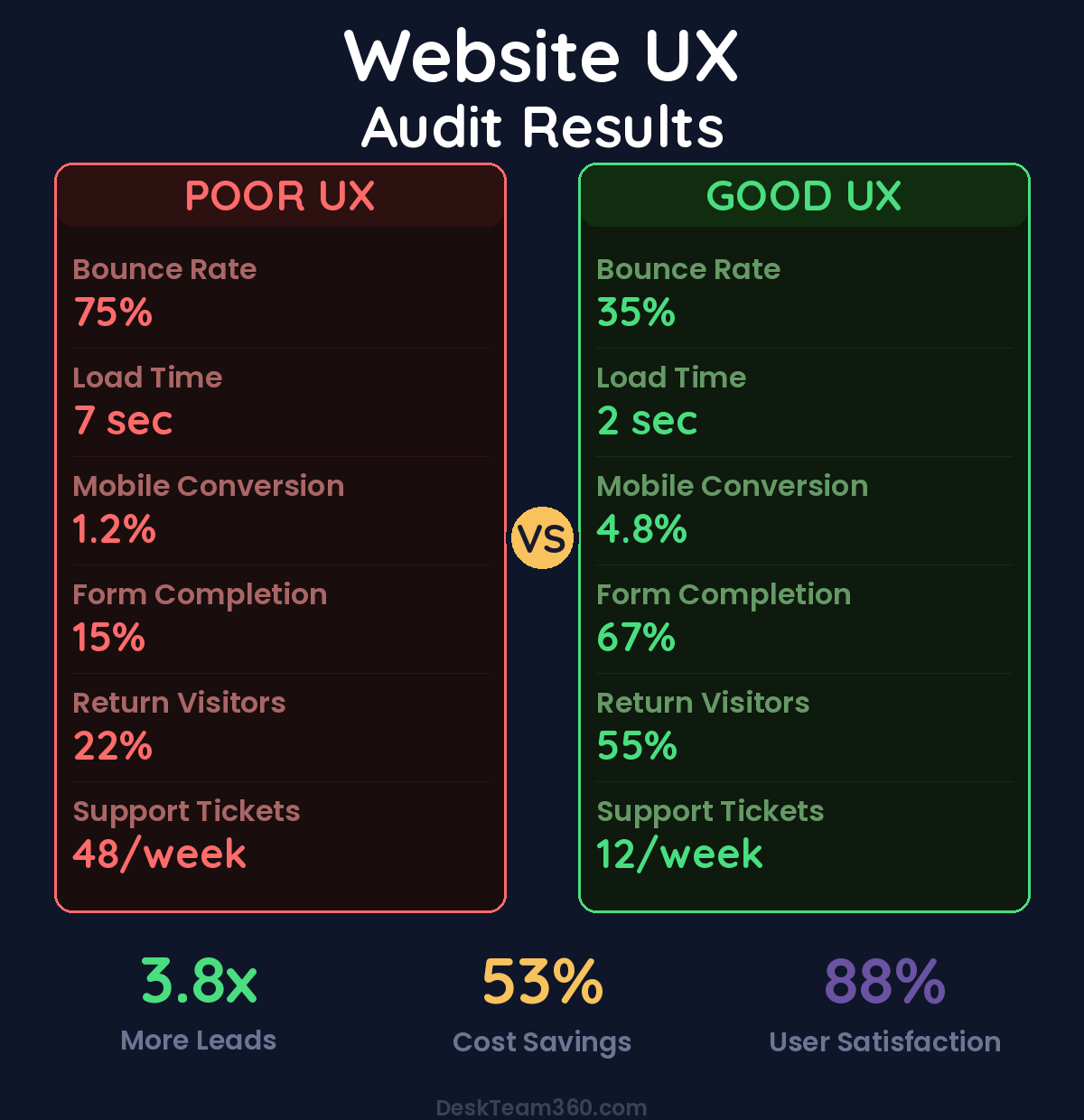
Figuring out how to audit website ux doesn’t have to be complicated. Here’s a number that should keep you up at night: 88% of people won’t return to a website after a bad experience. Not a bad product or bad pricing. A bad experience navigating your actual website.
📋 Table of Contents
I’ve watched this happen hundreds of times over 12+ years. A business spends $5,000 a month on ads to drive traffic, then loses half those visitors because their website feels like trying to solve a Rubik’s cube blindfolded. They blame the marketing when the real problem is that their site makes it impossible for people to do what they came to do.
A UX audit identifies exactly where your website is failing visitors and prioritizes what to fix first. This isn’t about making things prettier. It’s about removing the barriers between your visitors and becoming customers.
What a UX Audit Actually Is (And What It’s Not)
A UX audit is a systematic review of how real people experience your website. It finds the friction points, dead ends, and confusing elements that make people leave without buying anything.
What it is: a methodical evaluation of navigation, mobile experience, page speed, forms, and conversion flow that produces a prioritized list of fixes. What it’s not: a visual redesign (though you might need one after seeing the results), an SEO audit (different focus), or guessing what might be wrong based on your personal preferences.
Here’s what matters: UX, SEO, and performance are connected. A site with terrible user experience usually has terrible metrics that tank search rankings too. If you need a broader health check, our guide on website content audits covers the content optimization side.
Free 5-Minute Video
See How DeskTeam360 Works in Under 5 Minutes
Watch the short video and see exactly how we handle design, development, and marketing implementation — so you don't have to.
Watch the Video →
The Complete DIY UX Audit Framework
Work through each section and score items as “Good,” “Needs Work,” or “Critical Problem.” By the end, you’ll have a clear action plan ranked by impact.
First Impressions and Homepage Reality Check
Open your homepage in a new browser tab like you’ve never seen it before. Better yet, grab someone who doesn’t know your business and give them 5 seconds to tell you what your company does. The results are usually humbling.
Your value proposition should be crystal clear above the fold. Within 5 seconds, any visitor should understand what you do, who you serve, and why they should care. If someone has to scroll or think to figure out what you’re selling, you’ve already lost them.
Visual hierarchy matters more than you think. The eye should flow naturally from your headline to supporting text to your primary call-to-action. If everything on the page screams for attention equally, nothing gets attention. Pick one main thing you want people to do and make that obvious.
Watch out: Auto-playing videos or aggressive popups that appear before someone has even read your homepage destroy trust instantly. I’ve seen conversion rates drop by 30% from a single intrusive popup that fires too early.
Trust signals need to be visible without scrolling. Client logos, review ratings, years in business, certifications. These aren’t vanity elements, they’re conversion drivers that reduce purchase anxiety.
Navigation That Actually Helps People Find Things
Your navigation is how people explore your site. If it’s confusing, people leave. If it’s broken, people definitely leave.
Keep your main navigation to 7 items or fewer. More than that creates choice paralysis where people freeze up and click nothing. Use dropdown menus to organize related pages under broader categories.
Label things clearly. “Solutions” means nothing. “Services” or “What We Do” is clear. “Resources” without context is vague corporate speak. Say what things are, not what you think sounds impressive.
The 3-click rule still matters. Any important page should be reachable within 3 clicks from your homepage. If someone has to click through 6 levels to find your pricing, restructure your site architecture immediately.
Your search function better actually work if you have one. Test it yourself. Search for your main services or products. Do the results make sense? If your site search returns garbage, people will assume your business operates the same way.
Related reading: What Is a Marketing Tech Stack? Essential Tools and How to Audit Yours.
Pro tip: Your 404 error page is a conversion opportunity disguised as a problem. Instead of a dead end, make it helpful. Link to your most popular pages, include a search box, or redirect to related content. Turn the mistake into a way to keep people on your site.
Mobile Experience (Where Most People Actually Visit Your Site)
More than half your traffic comes from mobile devices, so pull up your website on your phone right now and actually use it. Try to complete the main action you want visitors to take. I’ll wait.
Text needs to be readable without zooming. Body text should be at least 16px on mobile. Smaller fonts force people to pinch and zoom, which is annoying enough that many will just leave instead.
Buttons and links must be finger-friendly. The minimum touch target is 44×44 pixels. Tiny links that require precise tapping are usability failures. If you’re struggling to tap your own navigation menu, so are your customers.
Forms on mobile deserve special attention because they’re where you convert visitors into leads. Can you actually fill out your contact form on a phone without wanting to throw it? Field sizes, keyboard types (number pad for phone numbers, email keyboard for email addresses), and form layout all matter on small screens.
No horizontal scrolling, ever. Everything needs to fit within the screen width. If content overflows and people have to scroll sideways, your mobile layout is broken.
Page Speed (The Silent Conversion Killer)
Page speed kills conversions and search rankings simultaneously. For every second your page takes to load, you lose roughly 7% of potential customers. Amazon famously calculated that a 100ms delay costs them 1% of revenue.
Test your site with Google PageSpeed Insights, GTmetrix, and WebPageTest. You want under 3 seconds load time on mobile, under 2.5 seconds for Largest Contentful Paint, and minimal layout shift as the page loads.
Sites that load in 3 seconds or less convert 70% more visitors than sites that take 5+ seconds to load.
Common speed killers are unoptimized images, too many plugins, render-blocking JavaScript, and lack of caching. For WordPress sites specifically, our guide on speeding up WordPress websites covers the technical fixes.
Forms and Conversion Points (Where You Win or Lose)
Forms are where visitors become customers or where you lose them to frustration. Every extra field reduces completion rates. Every confusing error message sends people to your competitors.
Ask for the minimum information you actually need. Name, email, and message is enough for most contact forms. Phone number if you’re going to call them. Company name if it’s B2B. Everything else can wait until later in the relationship.
Error messages need to be helpful, not just technically correct. “Invalid input” tells someone nothing. “Please enter a valid email address” or “Phone number should be 10 digits” actually helps people fix the problem.
Success confirmation has to be obvious. After someone submits a form, they need clear confirmation it worked. A brief thank-you message or redirect to a thank-you page. Don’t leave people wondering if their form actually went through.
Calls to Action That Actually Drive Action
Your CTAs are the bridge between interest and action. Weak CTAs mean people who want to buy from you don’t know how to take the next step.
We break this down further in how to outsource app ui/ux design: mobile and saas guide.
At least one CTA should be visible above the fold on every important page. If people have to scroll to find out how to work with you, many won’t bother scrolling.
CTA copy needs to be action-oriented and specific. “Get Started,” “Request a Quote,” “Download the Guide” work. “Submit,” “Click Here,” and “Learn More” don’t. Tell people exactly what happens when they click.
Only one primary CTA per page. Multiple competing CTAs dilute effectiveness because people don’t know which action is most important. Pick the one thing you want most and make it prominent. Secondary actions can be text links.
Content That People Actually Read
Most website visitors scan rather than read every word. Your content needs to work for scanners and readers both.
Paragraphs should be short. 2-3 sentences maximum. Walls of text don’t get read, they get skipped. Break up longer thoughts into multiple paragraphs with natural transitions.
Subheadings every 200-300 words let scanners find what they’re looking for quickly. Use them generously. Each subheading should give someone a reason to keep reading that section.
Line height and contrast matter for readability. Text that’s cramped together or light gray on white backgrounds strains the eyes. Use 1.5-1.8 line height and dark text on light backgrounds.
Kill the jargon without mercy. If your target audience doesn’t immediately understand phrases like “synergistic solutions” or “leverage our core competencies,” don’t use them. Clear language converts better than impressive-sounding nonsense.
Trust and Credibility Elements
Visitors evaluate whether they can trust you from the moment they land on your site. Small details either build confidence or create doubt.
Use real team photos, not stock photos of people who don’t work for you. Fake employee photos feel deceptive and they’re easy to spot. Client logos and testimonials provide social proof that reduces purchase anxiety.
Contact information should be easy to find. Phone number, email, physical address if applicable. Hidden contact info signals a business that’s hard to reach when problems arise.
SSL certificates are non-negotiable. If your site shows “Not Secure” in the browser bar, fix it immediately. It’s a trust killer and a search ranking factor.
Content freshness signals whether your business is active. Copyright dates showing “2019” or blog posts from three years ago suggest neglect. Keep your content current or remove dates entirely.
Tools for Data-Driven UX Insights
The manual checklist above catches obvious issues. For deeper analysis, these tools show you what real visitors actually do on your site.
Heatmaps and Session Recordings
Hotjar and Microsoft Clarity both offer heatmaps showing where people click, scroll, and move their mouse. Session recordings let you watch real visitors navigate your site like you’re looking over their shoulder.
Look for rage clicks where people rapidly click the same spot, indicating frustration. Notice how far people scroll before leaving. See if they’re trying to click things that aren’t actually clickable, which indicates confusing design.
For industry benchmarks and research, see Google’s web.dev.
For industry research and benchmarks, check out Nielsen Norman Group.
Analytics Deep Dive
Google Analytics reveals UX problems through user behavior data. Pages with bounce rates above 70% likely have usability issues. Exit pages show where people decide to leave your site.
Compare mobile versus desktop conversion rates. If mobile converts at half the rate of desktop, your mobile experience needs work. Our guide on improving website conversion rates covers the analytics setup and optimization process.
Lightweight User Testing
Nothing replaces watching real people use your website. Formal user testing costs thousands, but you can do basic testing cheaply.
Ask 5 people who aren’t familiar with your site to complete a specific task like finding your pricing or submitting a contact form. Watch them without helping or guiding. Note where they hesitate, get confused, or give up. Five users reveal about 80% of usability issues.
How to Prioritize What to Fix First
After your audit, you’ll have a long list of problems. Here’s how to tackle them in order of impact.
Companies that fix mobile issues first see 65% better results than those who start with desktop optimization, because mobile represents the majority of traffic.
Fix mobile usability issues first since they affect the majority of your traffic. Broken forms and CTAs come next because they directly prevent conversions. Page speed issues hurt both user experience and search rankings, so they’re high priority.
Content readability improvements, CTA optimization, and form simplification are second-tier fixes with solid ROI. Trust signal additions and navigation refinements follow.
Save A/B testing, advanced personalization, and progressive design improvements for ongoing optimization once the fundamentals are solid.
When DIY Isn’t Enough
A self-audit catches obvious problems, but some situations require professional expertise.
If you’ve fixed the basics and conversions are still low, a UX professional can identify nuanced issues you missed. Complex sites like e-commerce platforms or SaaS products have more potential failure points that require expertise to diagnose.
Professional UX audits typically cost $2,000-10,000 depending on site complexity. For businesses where the website drives significant revenue, the ROI usually pays for itself within weeks through improved conversion rates.
Making UX Improvements Without Starting Over
You don’t need a complete redesign to fix most UX problems. Small, targeted improvements often deliver better results than flashy overhauls that introduce new problems.
Simplify forms by removing unnecessary fields. Move CTAs higher on the page. Increase font sizes and line heights. Fix mobile layout issues. Add trust signals to key pages. Optimize images and enable caching to improve speed.
These incremental changes compound. Fixing 10 small friction points can improve conversion rates more than a complete redesign. Most of these changes don’t require developers either. A competent team can handle them through regular website maintenance.
Stop Losing Customers to Poor User Experience
At DeskTeam360, we audit websites, fix UX problems, optimize mobile experiences, and improve conversion rates as part of our comprehensive website management. No per-project billing, no surprise costs. Just steady improvements that turn more visitors into customers.
Free Tool
How Much Is Freelancer Management Really Costing You?
Most agency owners have never done this math. Plug in a few numbers and see your real cost in 2 minutes.
Calculate Your Hidden Costs →