
A Professionally Designed Website Depends on These 8 Elements
Why Most Small Business Websites Look Like Garbage
Let’s talk about professional website design elements. I’ve audited over 1,200 small business websites in the last three years, and 80% of them have the same problem. They look like they were designed by someone’s cousin in 2015 using a template that cost $39.
📋 Table of Contents
The owner spent months agonizing over the logo, picked colors they personally liked, and then wondered why their bounce rate is 75% and their conversion rate is stuck at 1.2%. Meanwhile, their competitor down the street has a website that looks professional and converts visitors into customers.
Here’s the thing, your website isn’t art hanging in a gallery. It’s a business tool that needs to do specific things: build trust, communicate value, and convert visitors into leads or customers. The design either helps that happen or actively hurts it.
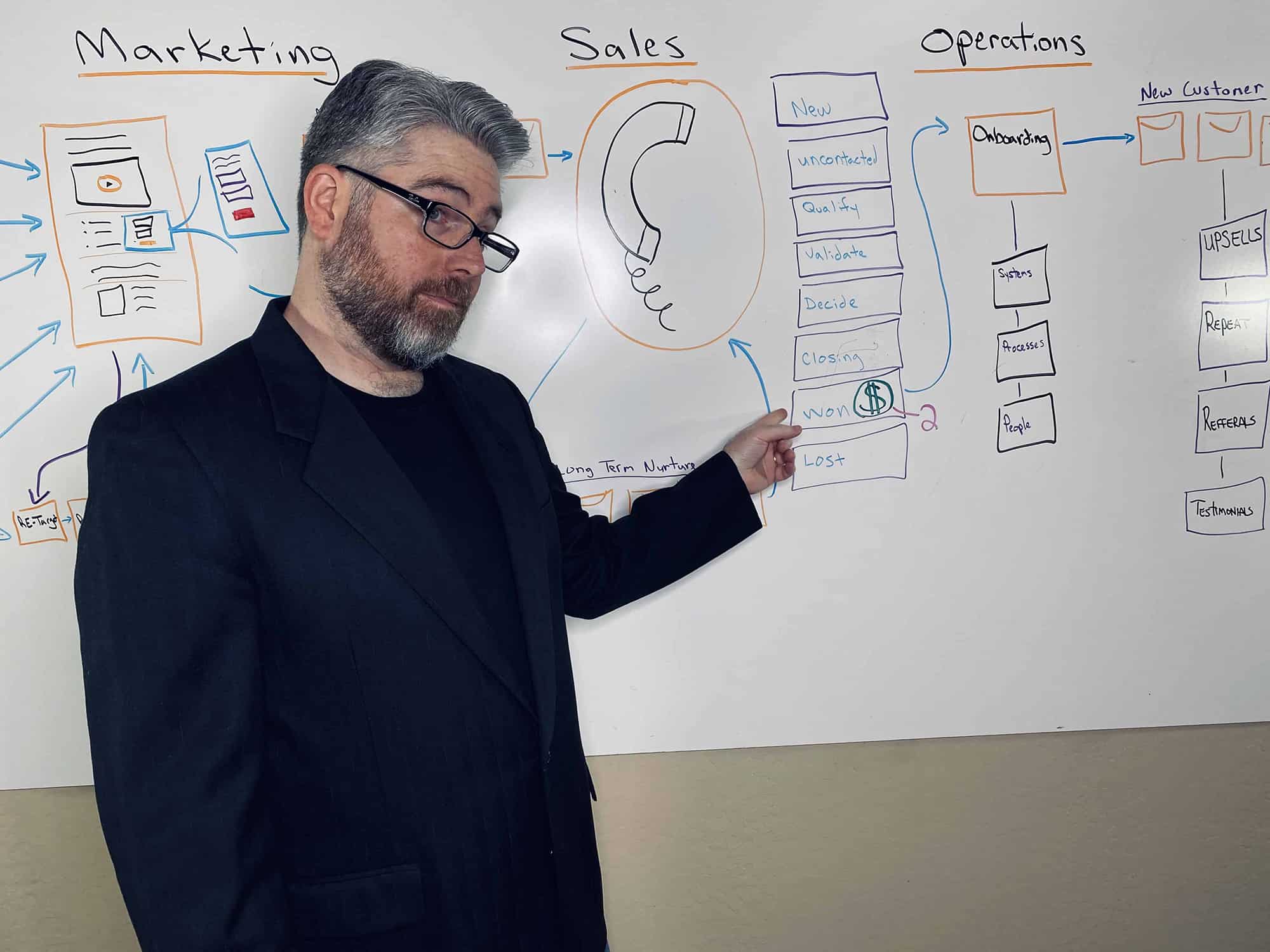
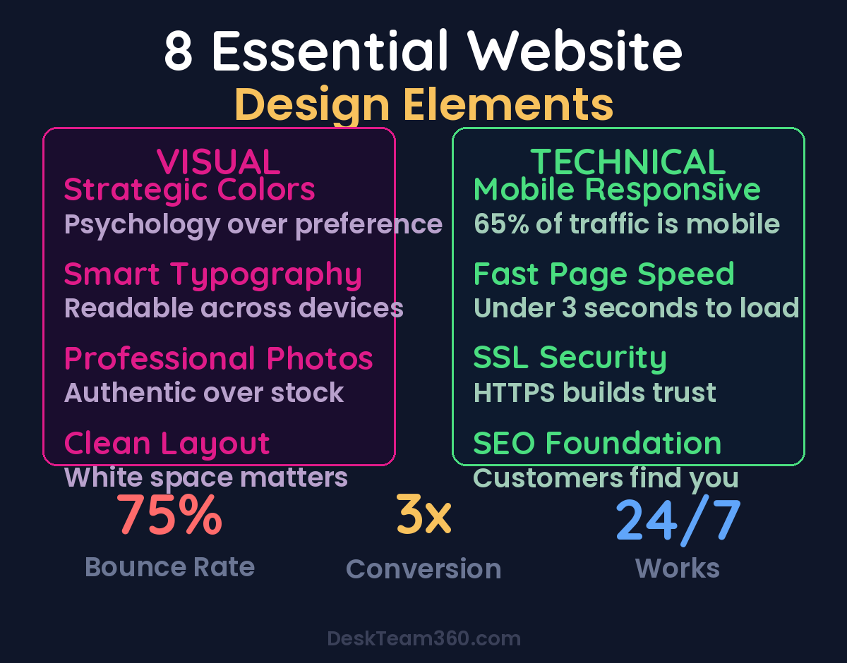
After working with 400+ clients at DeskTeam360, I’ve identified the 8 elements that separate professional websites from amateur hour. Half are visual, half are technical. Miss any of them and your website becomes a liability instead of an asset.
The Visual Foundation: What Your Eye Sees First
Visual design isn’t about making things pretty, although that’s a nice side effect. It’s about using psychology and proven patterns to guide your visitor toward the action you want them to take. Every color, font, image, and layout choice should serve that purpose.
Element 1: Strategic Color Choices
Color isn’t decoration. It’s one of the most powerful conversion tools you have, and most business owners completely waste it.
I see this constantly. A financial advisor picks bright orange because it’s “energetic,” not realizing that orange makes people think of construction cones and warning signs. Meanwhile, their competitor uses deep blues and grays, colors that actually convey trust and stability. Guess whose website generates more qualified leads?
Here’s what actually works. Use color psychology intentionally: blue builds trust (perfect for financial services, healthcare, tech), green suggests growth and stability (great for financial planning, sustainable products), black and gray convey luxury and sophistication (ideal for premium services), and red creates urgency but use it sparingly for calls-to-action only.
The technical rule is 60-30-10: 60% dominant neutral color, 30% secondary brand color, 10% accent color for buttons and highlights. This creates visual hierarchy without overwhelming your visitor’s brain.
Element 2: Typography That Actually Works
Bad font choices make even good content unreadable. I’ve seen law firms using Comic Sans and fitness coaches using ultra-thin fonts that disappear on mobile screens. Your typography needs to match your brand personality and, more importantly, be readable across all devices.
There are three font categories, and each one sends a different message. Serif fonts like Times New Roman feel traditional and professional, perfect for law firms, financial advisors, and established businesses. Sans-serif fonts like Arial feel modern and approachable, ideal for tech companies, agencies, and creative services. Script fonts look like handwriting and feel personal but they’re often hard to read, so use them sparingly for logos or accent text only.
Pro tip: Stick to two fonts maximum. One for headings, one for body text. If you need a third accent font, make sure it’s used sparingly. More than three fonts makes your website look like a ransom note.
Font size matters more than you think. Your body text should be at least 16px on desktop and 18px on mobile. Anything smaller forces visitors to squint, and people don’t squint for businesses they don’t trust yet. Headers should create clear visual hierarchy: H1 should be the biggest, H2 smaller, H3 smaller still.
Element 3: Photography That Builds Trust
Stock photography can kill your credibility faster than a 90s website design. Nothing screams “I didn’t invest in my business” like seeing the same generic handshake photo on twelve different websites in your industry.
I’ve watched potential clients close browser tabs the moment they see obvious stock photos. It signals that you either don’t take your business seriously or you’re trying to appear bigger than you are. Both destroy trust.
Your photos need to do four things: represent your actual business (not some fantasy version), appeal to your target demographic, match your brand colors and style, and be high resolution across all devices. If you’re a personal brand, invest in professional photos immediately. Not just headshots, but lifestyle shots that show you in your element.
The consistency rule is non-negotiable. All your photos should look like they were taken by the same photographer using the same style. Mixed photo styles make your website look cobbled together from random sources.
For service businesses, photos of your actual team and office space build more trust than generic stock images ever will. Show real people doing real work for real clients. The slight imperfection of authentic photography actually increases credibility.
Element 4: Layout and Spacing Psychology
Cluttered websites make people’s brains hurt. I’ve tracked eye movement studies on hundreds of websites, and the pattern is always the same: too much information in too little space causes visitors to leave within 8 seconds. They literally can’t process what they’re looking at fast enough to make a decision.
White space isn’t empty space, it’s breathing room for your content. It guides the visitor’s eye to what matters most and makes everything else easier to read. Think of it like a well-organized store versus a cluttered garage sale. Both might have good products, but one feels professional and the other feels overwhelming.
The F-pattern is how people actually read websites. They scan horizontally across the top, then scan down the left side looking for interesting information. Your layout should follow this natural eye movement pattern. Put your most important information in the top horizontal area and down the left side.
Mobile-first design isn’t optional anymore. 65% of website traffic comes from mobile devices, so if your layout doesn’t work perfectly on a phone, you’re losing two-thirds of your potential customers before they even see your content.
Free Template
The Ultimate Task Delegation Template
Stop guessing what to hand off. This template shows you exactly what to delegate, how to brief it, and how to QA the results.
Get the Free Template →
The Technical Foundation: What You Can’t See But Everyone Feels
Visual design gets people to stay on your website. Technical design determines whether they can actually use it. All the beautiful colors and fonts in the world won’t save a website that takes 12 seconds to load or breaks on mobile devices.
Element 5: Mobile-First Responsive Design
I still see business owners testing their websites only on their desktop computer, then wondering why their bounce rate is so high. Meanwhile, their website looks like a disaster on phones and tablets.
Responsive design means your website automatically adapts to different screen sizes. Text should be readable without zooming, buttons should be large enough to tap with a thumb, and navigation should work intuitively on touch screens. If visitors have to pinch and zoom to read your content, they won’t.
For a deeper dive, see our guide on how to outsource graphic design on a budget (without sacrificing quality).
Watch out: Don’t assume your website is mobile-friendly just because it’s built on WordPress or Shopify. Test it yourself on multiple devices. Better yet, hand your phone to someone who’s never seen your website and watch them try to find your contact information.
Google’s mobile-first indexing means they primarily use the mobile version of your website for ranking and indexing. A website that doesn’t work on mobile doesn’t just frustrate visitors, it actively hurts your search engine rankings.
Element 6: Page Speed That Doesn’t Lose Customers
Every second your website takes to load costs you customers. Amazon found that a 1-second delay in page load time costs them $1.6 billion in revenue annually. Your small business can’t afford to ignore those numbers.
The magic number is 3 seconds. That’s how long the average visitor will wait before hitting the back button. If your pages take longer than that, you’re bleeding potential customers to competitors with faster websites.
The biggest culprits are oversized images, too many plugins, cheap hosting, and unoptimized code. Compress your images before uploading them (aim for under 150KB per image), remove plugins you don’t actually need, and invest in quality hosting. The extra $20 per month for better hosting pays for itself if it saves even one customer per month.
Websites that load in under 2 seconds see 47% higher conversion rates than those that take 5+ seconds to load.
Element 7: SSL Security That Builds Trust
If your website URL doesn’t start with “https://” and show a lock icon in the browser bar, you’re telling visitors that your website isn’t secure. That’s a credibility killer, especially for any business that handles sensitive information or processes payments.
SSL encryption protects data as it travels between your visitor’s browser and your website server. It prevents hackers from intercepting things like login credentials, personal information, and credit card details. More importantly for most businesses, it signals trustworthiness.
Google actively penalizes websites without SSL certificates in search rankings and Chrome browsers display scary “Not Secure” warnings for non-HTTPS sites. Those warnings make your business look unprofessional and potentially dangerous, even if you’re just selling lawn care services.
SSL certificates used to cost hundreds of dollars annually. Now most quality hosting providers include them for free. There’s literally no excuse for not having one in 2026.
Element 8: SEO Foundation That Gets Found
The most beautiful, fastest website in the world is worthless if your ideal customers can’t find it. Search engine optimization isn’t about gaming Google’s algorithm, it’s about making your website helpful and relevant for the people searching for what you offer.
Basic SEO starts with understanding what your customers actually search for. Tools like Google’s Keyword Planner or even just Google’s autocomplete suggestions will show you the exact phrases people type when they need your services. Use those phrases naturally in your page titles, headers, and content.
For industry research and benchmarks, check out Nielsen Norman Group.
Technical SEO includes things like proper meta descriptions (the text that appears under your website link in search results), descriptive page titles, alt text for images, and a logical site structure with clear navigation. These elements help search engines understand what your website is about and why it should be recommended to searchers.
Local SEO matters especially for service businesses. Make sure your business name, address, and phone number are consistent across your website, Google My Business listing, and all online directories. Reviews and local citations signal to Google that you’re a legitimate local business worth recommending.
The Hidden Cost of Getting This Wrong
Most business owners think of their website as a marketing expense. That’s backward thinking. A professionally designed website is a revenue generator that works 24/7, builds trust with prospects, and converts visitors into customers even when you’re sleeping.
Let’s do the math for a typical service business. If your website gets 1,000 visitors per month and converts at 2%, that’s 20 leads. Improve the design and user experience to get that conversion rate to 5%, and you’re getting 50 leads from the same traffic. Those extra 30 leads per month could be worth $50,000-100,000+ in annual revenue depending on your average customer value.
The businesses that understand this invest in professional website design and see it pay for itself within months. The ones that don’t wonder why their competitors always seem to be busier despite offering similar services.
Your Website Audit Checklist
Run through these 8 elements on your current website. Be honest about what needs improvement.
Pull up your website on your phone right now. Can you easily read everything without zooming? Are the colors and fonts consistent with your brand? Do the photos look professional and authentic? Does everything load quickly? Do you see the green lock icon in your browser bar?
If you’re missing any of these elements, prioritize fixing them based on impact. SSL certificates and mobile optimization are non-negotiable basics. Page speed and professional photography will give you the biggest boost in credibility and conversions.
Pro tip: Test your website with people outside your industry. What seems obvious to you might be confusing to someone encountering your business for the first time. Fresh eyes will catch problems you’ve become blind to.
Your website should work for your business, not against it. These 8 elements aren’t suggestions or nice-to-haves, they’re requirements for competing in today’s market. Get them right, and your website becomes one of your most valuable business assets.
At DeskTeam360, we help service businesses get all 8 elements working together seamlessly. From optimizing customer support pages to implementing proper bounce rate reduction strategies, we handle the technical details so you can focus on running your business. Our team has optimized websites for everything from AI-powered customer support integration to complete marketing ROI tracking systems.
Free 5-Minute Video
See How DeskTeam360 Works in Under 5 Minutes
Watch the short video and see exactly how we handle design, development, and marketing implementation — so you don't have to.
Watch the Video →