


Outsource Whitepaper Design and Layout: A Complete Guide for B2B Marketers

Why Most B2B Whitepapers Look Like Garbage
When you outsource whitepaper design, you’re making a strategic move. I need to call out something that’s been bugging me for years. B2B companies spend weeks writing brilliant whitepapers filled with original research and genuine insights. Then someone dumps it into a Word template, exports to PDF, and calls it done. The result? A 15-page document that looks like a college research paper nobody wants to read.
📋 Table of Contents
This drives me crazy because whitepapers work. According to the Content Marketing Institute, 71% of B2B buyers have downloaded whitepapers in the last 12 months to research purchasing decisions. They’re the third most influential content type in B2B, right behind case studies and webinars.
But here’s the problem: most of them look terrible. No visual hierarchy. No data visualization. No design thinking whatsoever. Your content team writes a fantastic whitepaper with original research that could generate hundreds of leads. Then the design kills it before anyone gets past the cover page.
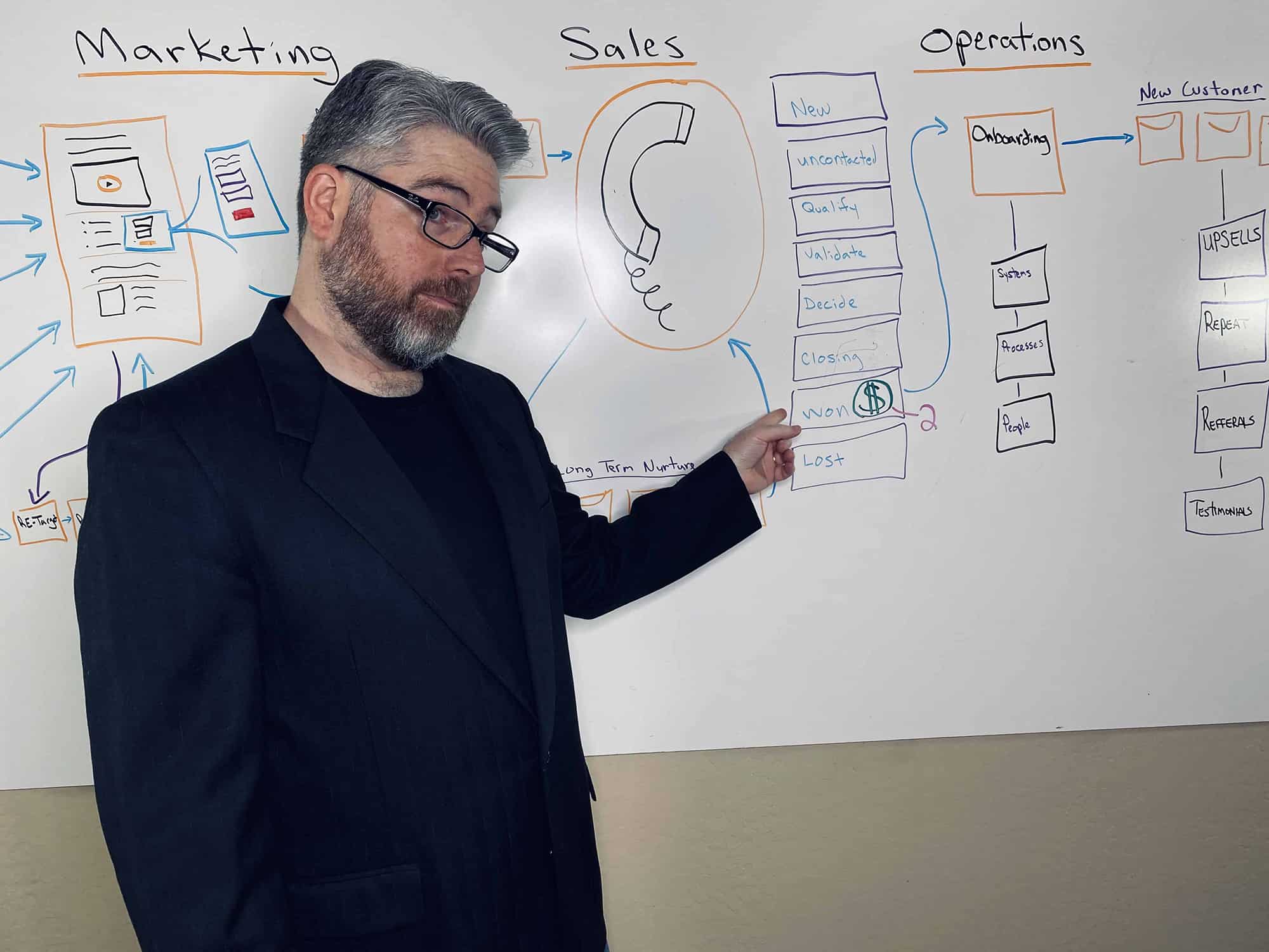
I’ve been running marketing teams for over 12 years and managing outsourced teams for 400+ clients. I’ve seen this pattern hundreds of times. The solution isn’t complicated, but it requires admitting that design matters just as much as content. Here’s exactly how to outsource whitepaper design and layout so your content actually converts.
What Separates Great Whitepaper Design from Mediocre
Before you outsource anything, you need to understand what makes a whitepaper worth downloading and reading. Most companies skip this step and wonder why their “professionally designed” whitepaper still performs poorly.
The Cover Determines Everything
Your cover is the packaging. It’s what prospects see on your landing page, in their email, and when they decide whether to actually open the PDF. A strong cover increases download rates by 20-30%, and the difference between good and bad is obvious once you know what to look for.
Great covers communicate the topic instantly. They look professional and on-brand. They include a compelling title and subtitle that promises value. And they feature a strong visual element, not a stock photo of people pointing at a whiteboard.
Visual Hierarchy That Acknowledges How People Actually Read
Nobody reads a 15-page document word by word. People scan. They look for headers, pull quotes, and visual breaks that help them navigate to the information they want. Your design needs to account for this reality.
Clear section headers should be large, bold, and impossible to miss. Pull quotes need to highlight key statistics or insights in larger text that catches the scanner’s eye. Sidebars should contain supplementary information, definitions, or examples in separate boxes. And you need ample white space because cramming content makes everything harder to read.
The best whitepapers alternate between full-width text, two-column layouts, and graphic-heavy pages. This variety keeps readers engaged instead of confronting them with endless walls of text.
Data Visualization That Actually Clarifies
If your whitepaper includes research, statistics, or data (and it should), that information needs to be visualized, not buried in paragraphs where it gets skipped.
For more on this, check out our guide on outsource course creation and design: the complete production guide.
We break this down further in what is white label marketing? the complete guide for agencies.
Custom charts and graphs beat Excel exports every time. They’re not just prettier, they’re designed to highlight the specific insights you want readers to remember. Infographic elements like process flows, comparison tables, and timeline graphics help readers understand complex information quickly. Icon-based callouts work perfectly for quick-scan statistics like “78% of marketers say this approach failed.”
The difference between a chart you made in Excel and a professionally designed data visualization is the difference between a PDF that gets skimmed and one that gets shared with the entire buying committee.
Free 5-Minute Video
See How DeskTeam360 Works in Under 5 Minutes
Watch the short video and see exactly how we handle design, development, and marketing implementation — so you don't have to.
Watch the Video →
When DIY Templates Work (And When They Don’t)
Let’s be honest about the DIY route because I get this question constantly.
Templates from Canva, Visme, or InDesign can work for simple whitepapers under 8 pages that are mostly text with minimal data. If you have someone on your team with decent design sense and the whitepaper is more of an internal document than a primary lead generation asset, templates might be sufficient.
But you need professional design when the whitepaper is a cornerstone of your lead generation strategy. When it contains complex data that needs visualization. When it represents your brand to enterprise buyers. When it’s 10+ pages with mixed content types. And definitely when you’re competing against well-funded competitors with polished content.
Pro tip: Think of it this way. If you’re gating this content behind a form and running ads to drive downloads, professional design isn’t an expense, it’s an investment that pays for itself with better conversion rates.
Understanding the Real Cost of Bad Design
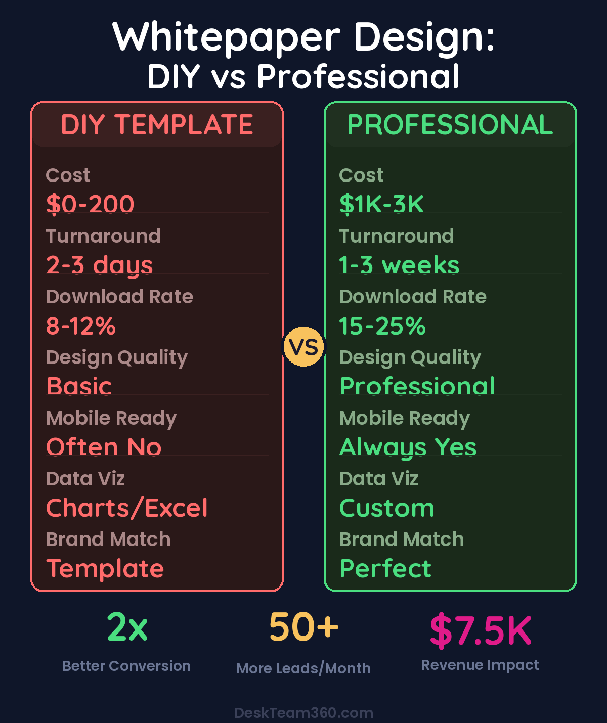
Here’s what most companies miss. You might save $2,000 by using a template instead of hiring a designer. But if bad design cuts your conversion rate from 15% to 10% on a landing page that gets 1,000 visitors per month, you’re losing 50 leads every month. At a 3% close rate and $5,000 average deal value, that’s $7,500 in lost revenue. Per month.
The math gets worse when you factor in the time your internal team spends fighting with templates that weren’t built for complex documents. What starts as a cost-saving measure ends up costing more in both direct revenue loss and opportunity cost.
Your Outsourcing Options Ranked
I’ve worked with every type of design outsourcing option over the years. Here’s what actually works and what doesn’t.
Freelance Designers: High Risk, High Reward
Freelancers can be fantastic if you find the right person. You can locate specialists who understand B2B content and long-form document design. The cost is reasonable for one-off projects, typically $500-$3,000 per whitepaper depending on complexity and the designer’s experience.
The problems are inconsistent availability, no backup if they get busy or disappear, and you end up managing the entire project yourself. Finding a good freelancer takes time and involves reviewing portfolios, checking references, and often working with 2-3 people before finding one who gets it right.
Watch out: Many freelancers who claim whitepaper experience actually specialize in single-page graphics. Multi-page document design requires different skills than social media graphics or logo design. Ask to see whitepaper-specific examples before hiring anyone.
Related: Responsive Web Design Best Practices: The Complete Guide.
Design Agencies: Overkill for Most Businesses
Agencies deliver high quality and provide full project management with dedicated teams. But they’re expensive ($3,000-$10,000+ per whitepaper), slower (2-4 weeks turnaround), and frankly overkill for most businesses. Unless you’re a Fortune 500 company producing quarterly whitepapers for enterprise sales cycles, agencies are probably more than you need.
Design Subscription Services: The Best Value for Regular Content
For businesses that produce whitepapers regularly, design subscription services offer the best combination of quality, speed, and cost-effectiveness. You pay a flat monthly rate ($399-$999) that covers unlimited design requests including whitepaper design, social media graphics, email templates, and everything else you need.
The turnaround is fast (1-3 business days per revision), the quality is consistent, and you’re not paying $2,000 per project. If you’re producing whitepapers quarterly or more frequently, this model usually wins on pure economics. Our comprehensive guide on graphic design subscription services breaks down all the major players if you want the detailed comparison.
Platforms Like Fiverr and Upwork: Proceed with Caution
Fiverr and Upwork offer huge selection and competitive pricing ($200-$1,500 typical range), but the quality varies dramatically. You’ll spend significant time vetting candidates, and even then results are unpredictable. For detailed analysis of these platforms, check out our Fiverr vs. Upwork vs. subscription service comparison.
How to Brief Your Designer for Maximum Results
The quality of your handoff determines the quality of the result. Most companies rush this step and end up in endless revision cycles that cost time and money.
Content Preparation That Saves Everyone Time
Provide final, proofread copy. Don’t send a rough draft because design changes are expensive once layout begins. Mark your heading hierarchy clearly with H1, H2, and H3 tags. Indicate where you want callouts, pull quotes, sidebar content, and key statistics highlighted. And include notes about where you want visuals and what data they should represent.
Brand asset requirements are non-negotiable. You need logo files in vector format (AI, EPS, or SVG), brand colors with hex codes, brand fonts or acceptable alternatives, and any existing brand guidelines. Without these basics, even the best designer can’t create something that looks professional.
Include a design brief that describes your target audience, the desired tone (corporate, modern, technical, approachable), examples of whitepapers you like (even from competitors), and any specific requirements like print versus digital-only or interactive elements. If you need help creating brand guidelines, our guide on how to create a brand style guide covers the fundamentals.
Setting Expectations for the Design Process
Professional whitepaper design should follow a structured process. You provide the content handoff with all the materials mentioned above. The designer creates 2-3 cover concepts and a sample interior page layout. You review and provide direction. Then they complete the full whitepaper design with all pages. Finally, you get at least 2 rounds of revisions plus final delivery including print-ready PDF, web-optimized PDF, and source files.
If a designer skips the concept stage and jumps straight to full design, that’s a red flag. You’ll end up in endless revision cycles because you never aligned on the visual direction upfront.
Critical Design Mistakes That Kill Conversions
I’ve reviewed hundreds of whitepapers over the years, and certain mistakes appear over and over again. Avoiding these issues will put your whitepaper ahead of 80% of what’s out there.
Related reading: 10 Best Unlimited Graphic Design Services for 2026 (Honest Rankings).
For industry research and benchmarks, check out Clutch.co.
Too much text per page makes documents unreadable. Aim for 300-400 words per page maximum. Yes, this means a 3,000-word whitepaper should be 8-10 pages. The white space and visual elements make it readable, not padded.
Inconsistent branding makes your content look amateur. Every page should feel like it belongs to the same document and the same brand. Inconsistent fonts, colors, or layout styles break the professional impression you’re trying to create.
Ignoring mobile readability is a huge oversight since many people read PDFs on phones or tablets. If your whitepaper has tiny 8pt text in two columns, it’s unreadable on mobile. Consider a single-column layout with larger text, or create a separate mobile-optimized version.
Companies that optimize whitepapers for mobile see 35% higher completion rates compared to desktop-only designs.
Stock photo overload adds nothing and makes everything look generic. Generic photos of people pointing at whiteboards or shaking hands don’t enhance your content. Use custom illustrations, icons, branded graphics, or actual photos from your company instead.
Maximizing ROI Beyond the Initial Download
A well-designed whitepaper isn’t just a PDF, it’s a content engine that can fuel your marketing for months. Most companies download once and call it done, which wastes 80% of the potential value.
Start with a gated landing page that collects emails in exchange for the download. Break the whitepaper into 3-5 blog posts, with each one driving readers back to the full download. Pull statistics and charts for shareable social media graphics. Use the download as a trigger for an automated email nurture sequence. Give it to your sales team to share with prospects during discovery calls.
Consider turning the whitepaper content into webinar material or distilling key findings into a shareable infographic. Our guide on outsource infographic design explains how to repurpose research data into multiple visual formats.
One professionally designed whitepaper can generate leads, enable sales conversations, support content marketing, and enhance your brand reputation for months. The key is treating it as the beginning of a content campaign, not the end.
Stop Settling for Mediocre Design
Your team should focus on what you’re good at: creating original research, developing insights, and writing compelling content. Let design professionals handle the visual execution that makes your content actually worth downloading.
The ROI is clear and measurable. A professionally designed whitepaper converts better, reflects better on your brand, and generates more leads. And with today’s outsourcing options, it doesn’t have to cost a fortune or take weeks to complete.
The companies winning in B2B content marketing aren’t the ones with the biggest budgets. They’re the ones who understand that great content needs great design to reach its potential. Stop settling for Word document exports and start treating your whitepapers like the lead generation assets they should be.
Free Template
The Ultimate Task Delegation Template
Stop guessing what to hand off. This template shows you exactly what to delegate, how to brief it, and how to QA the results.
Get the Free Template →