


How to Create a Brand Style Guide (That People Actually Use)
Why Most Brand Style Guides Get Ignored
Knowing how to create a brand style guide can be the difference between growth and spinning your wheels. You’ve seen them. Those beautiful 80-page brand style guides that cost $15,000 and live in a Google Drive folder nobody opens. The designer shows up, presents this gorgeous document with pixel-perfect typography examples and color codes down to the third decimal, everyone nods approvingly, and then it gets completely ignored.
📋 Table of Contents
I see this constantly. Companies spend massive budgets on comprehensive brand guidelines, then their social media looks like it was designed by five different people who’ve never talked to each other. Their website uses three different fonts. Their email signatures are chaos.
The problem isn’t the brand guide itself, it’s that most guides are built to impress, not to be used. They’re art projects, not operational tools. After working with 400+ clients over 12 years, I’ve figured out what actually works. Here’s how to create a brand style guide that people will actually follow.
Start With the Brand Foundation, Not the Colors
Most brand guides start with the visual stuff because it’s fun. Logo variations, color palettes, typography hierarchies. That’s backward. Visual identity flows from brand strategy, not the other way around.
You need three foundational elements locked down first: your positioning statement (what you do, who it’s for, why it matters), your brand voice and personality (how you sound, what tone you use, what words you avoid), and your value propositions (the specific benefits customers get, not vague corporate speak).
Pro tip: Write your brand voice as if you’re describing a person. “We’re the knowledgeable friend who explains complex stuff in simple terms” works better than “We maintain a professional yet approachable tone.” Specific personality traits are easier to implement than abstract guidelines.
Everything else builds on this foundation. Colors, fonts, imagery style, they’re all expressions of the core brand, not arbitrary aesthetic choices. When your team understands who the brand is as a “person,” visual decisions become obvious instead of debatable.
The Five-Minute Brand Personality Test
Here’s a quick exercise I use with clients. If your brand walked into a party, what would happen? Would it be the center of attention telling stories, or the thoughtful one having deep conversations in the corner? Would it wear a tailored suit or jeans and a vintage t-shirt? Would it drink craft beer or single malt whiskey?
This isn’t silly fluff. These personality traits directly translate into design choices. The storyteller brand uses bold colors and dynamic layouts. The thoughtful one chooses elegant typography and plenty of white space. The craft beer brand has a completely different visual language than the whiskey brand.
Free Tool
How Much Is Freelancer Management Really Costing You?
Most agency owners have never done this math. Plug in a few numbers and see your real cost in 2 minutes.
Calculate Your Hidden Costs →
Make It Scannable, Not Comprehensive
Nobody reads 80-page documents. They scan, grab what they need, and move on. Structure your guide for how people actually work, not how you think they should work.
Start with a one-page quick reference card that covers the essentials: primary logo, two backup logo versions, core color codes (hex and RGB), primary and secondary fonts, and the brand voice in three bullet points. This lives on everyone’s desktop and gets printed for the office.
Then build modular sections for specific use cases. Website guidelines separate from print guidelines separate from social media guidelines. Each section should be 2-3 pages maximum, focused on one channel or context.
The 80/20 rule applies here. 80% of your brand decisions will come from 20% of your guidelines. Focus on making that 20% absolutely bulletproof and easy to find. The edge cases can live in appendices that most people will never need.
Include real examples everywhere. Don’t just show the logo, show it applied correctly on a website header, business card, and social media profile. Don’t just list brand voice principles, include sample copy for common situations like error messages, welcome emails, and social media captions.
Create Templates, Not Just Rules
Rules tell people what to do. Templates let them do it. The difference determines whether your brand stays consistent or becomes a game of telephone.
Build template libraries for everything your team creates regularly. Social media post templates in Canva or Figma. Email signature templates. PowerPoint deck templates. Website page layouts. Landing page structures. Even outline templates for blog posts and marketing copy.
Each template should be pre-loaded with the correct fonts, colors, spacing, and layout structure. Someone should be able to swap in new content and get on-brand results without making any design decisions.
Watch out: Don’t make templates so rigid that they become creative straightjackets. Include 2-3 layout options for each use case and clear guidelines for when to use which one. Flexibility within constraints works better than absolute rules.
The goal is to make following brand guidelines easier than ignoring them. When creating something on-brand takes less effort than creating something off-brand, consistency becomes automatic.
Define Your Visual Hierarchy System
Most brand guides show you the fonts and colors but don’t explain how to use them together. That’s like giving someone ingredients without the recipe.
Your visual hierarchy system defines how information flows on any piece of content. What size should headlines be relative to body text? How much white space goes between sections? What color combinations work for different types of information?
Create a clear system with specific rules: H1 headlines use the primary brand color at 48px, H2 subheads use dark gray at 32px, body text is 16px with 24px line height, buttons use the accent color with 16px of padding, and quotes get italicized in a lighter weight font. These aren’t suggestions, they’re specifications.
The Three-Layer Color System
Skip the 12-color palette that nobody can remember. Use a three-layer system instead: primary colors (your main brand colors, used for logos and key elements), secondary colors (supporting colors that complement the primary palette), and neutral colors (grays and blacks for text and backgrounds).
Most content should use neutrals with strategic pops of primary colors. Secondary colors are for special occasions, not everyday use. This system prevents color chaos while giving your team clear guidance for any situation.
Write Usage Guidelines for Real Scenarios
Generic brand guidelines say things like “maintain visual consistency across all channels.” Useful brand guidelines say “when creating Instagram Stories, use the primary logo in white on dark backgrounds, position it in the top-left corner with 40px margin, and overlay it at 70% opacity if using photography.”
Think about every context where your brand appears: website headers and footers, social media profiles and posts, email signatures and newsletters, business cards and letterhead, presentations and proposals, packaging and shipping materials, signage and trade show displays.
For each context, provide specific guidance on logo usage, color application, typography choices, imagery style, and common mistakes to avoid. Include side-by-side examples showing correct and incorrect implementations.
Our approach to content marketing strategy includes detailed brand application guidelines because consistency across all content is critical for building recognition and trust.
The Logo Usage Chart Everyone Needs
Create a simple chart showing your logo in different scenarios: primary logo on white background, primary logo on dark background, simplified logo for small sizes, black and white version for single-color printing, and horizontal version for wide spaces.
Include minimum size requirements and clear space specifications. “Don’t make the logo smaller than 150px wide” is more actionable than “maintain appropriate logo proportions.” Show what “clear space” means with actual measurements, not vague concepts.
Related reading: Outsource App Store Screenshot Design: The Complete Guide.
Build Quality Control Checkpoints
Brand guidelines without enforcement are just suggestions. You need systems to catch brand deviations before they go public.
Establish approval workflows for different types of content. Social media posts might need manager approval for messaging but not for standard template usage. Press releases and major announcements should go through the marketing team. Customer-facing materials always get final review.
Create a simple brand checklist for each type of content: does it use approved fonts and colors, is the logo sized and positioned correctly, does the voice sound like our brand, are we using approved imagery styles? This takes 30 seconds but prevents most consistency errors.
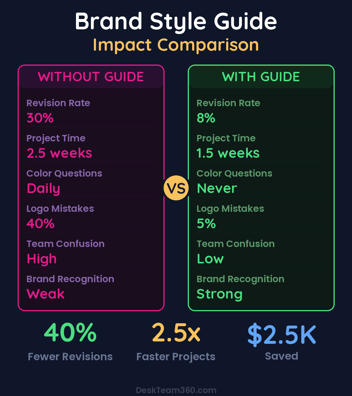
Companies with enforced brand guidelines see 73% fewer revision requests and 40% faster approval times compared to those relying on informal review processes.
Document common mistakes and how to fix them. When someone uses the wrong font, don’t just change it, show them where to find the right one. Turn every correction into a learning opportunity.
Keep It Living, Not Static
Your brand isn’t frozen in time, and neither should be your guidelines. Schedule quarterly reviews to update examples, add new use cases, and refine rules based on what’s actually working.
Track where brand consistency breaks down most often. Is it social media posts? Email campaigns? Sales presentations? Those patterns tell you where your guidelines need strengthening or where you need better templates.
Add new sections as your business grows. Launching a podcast? Add audio branding guidelines. Expanding internationally? Include cultural considerations for different markets. Starting video content? Define your video style standards.
The companies that maintain strong brands over years are the ones that treat their style guide as a living system, not a static document. Understanding how to create accessible, useful documentation applies to brand guidelines just as much as customer support materials.
Make Training Part of the Process
Even the best brand guide won’t work if people don’t know how to use it. Build training into your onboarding process and make it ongoing, not one-and-done.
New team members should walk through the brand foundations before they create any customer-facing content. Show them where to find templates, how to access the style guide, and who to ask when they’re unsure about something.
Pro tip: Create a “brand showcase” channel in Slack where team members can share examples of great brand implementation. Positive reinforcement works better than constant correction, and seeing good examples helps people internalize the standards.
Run monthly “brand review” sessions where you look at recent content together. What’s working well? Where are we starting to drift? What new scenarios do we need guidelines for? These sessions catch problems early and keep everyone aligned.
Measure Brand Consistency Impact
Brand consistency isn’t just about looking professional, it drives business results. Companies with consistent brand presentation see 23% higher revenue growth than those with inconsistent branding.
Track metrics that matter: brand recognition scores, time-to-approval for marketing materials, number of revision rounds per project, and customer feedback about brand perception. These numbers tell you whether your style guide is actually working.
For industry research and benchmarks, check out 99designs Blog.
Survey your team quarterly about brand guideline usage. Are the templates helping or hindering their work? What additional resources do they need? Where are they still making mistakes? This feedback drives continuous improvement.
External metrics matter too. Monitor social media engagement, email open rates, and website conversion rates after implementing stronger brand consistency. The correlation is often stronger than you’d expect. For more insights on tracking these metrics effectively, our guide on digital marketing analytics provides detailed measurement frameworks.
Technology That Actually Helps
The right tools can make brand consistency automatic instead of manual. Digital asset management systems like Brandfolder or Frontify centralize all your brand assets and templates. Design platforms like Canva Pro or Adobe Creative Cloud provide brand kits that lock in approved colors and fonts.
Use browser extensions and plugins that catch brand violations in real-time. Tools like Frontify’s brand checker can scan your website and flag inconsistencies. Grammarly Business can enforce voice and tone guidelines across all written content.
Automation is your friend here. Set up systems where approved templates automatically populate with current brand assets. Use conditional formatting in presentations so the right colors and fonts apply automatically. The less manual work required to stay on-brand, the better. For comprehensive automation strategies, see our guide on business process automation to streamline your entire operation.
The best brand technology is invisible. Your team shouldn’t have to think about staying on-brand, it should just happen naturally through the tools and systems they’re already using. When following guidelines requires extra effort, compliance drops dramatically.
Common Implementation Mistakes to Avoid
I’ve seen companies make the same mistakes repeatedly. Here’s how to avoid each one.
Creating guidelines that are too restrictive. If your brand guide has 47 different logo lockups and detailed specifications for every possible scenario, it’s too complex. Simplicity scales, complexity doesn’t.
Focusing on perfection over adoption. A simple guide that everyone follows beats a perfect guide that nobody uses. Start with the basics and evolve based on real usage patterns.
Not involving the people who will use it. Your graphic designer might love detailed typography specifications, but your social media manager needs quick reference templates. Build for your actual users, not your ideal users.
Treating it as a design project instead of a business system. Brand guidelines aren’t about making pretty documents, they’re about enabling consistent execution across your entire team. Focus on functionality over aesthetics.
No ownership or accountability. Someone needs to be responsible for maintaining and enforcing the guidelines, or they’ll degrade over time. Brand consistency requires ongoing attention, not periodic check-ins.
Build Your Brand System Today
A brand style guide that people actually use isn’t complicated, but it is strategic. Focus on the 20% of guidelines that drive 80% of brand decisions. Create templates that make consistency easier than chaos. Build review processes that catch problems before customers see them.
At DeskTeam360, we help businesses build brand systems that actually work in the real world, not just in theory. We handle everything from brand foundation development to template creation to team training, so your brand stays consistent as you scale.
Your brand is one of your most valuable assets. Don’t let inconsistent execution undermine its value.
Free 5-Minute Video
See How DeskTeam360 Works in Under 5 Minutes
Watch the short video and see exactly how we handle design, development, and marketing implementation — so you don't have to.
Watch the Video →