


Responsive Web Design Best Practices: The Complete Guide
Let’s talk about responsive web design best practices and why it matters for your business.
📋 Table of Contents
Mobile Traffic Isn’t a Trend, It’s Reality
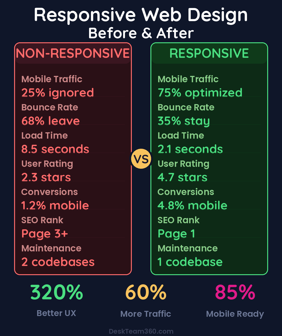
Let me drop a stat that still catches business owners off guard: over 60% of all web traffic now comes from mobile devices. For restaurants, local services, and e-commerce, it’s closer to 75%. If your website doesn’t work flawlessly on a phone, you’re not just losing some visitors. You’re losing the majority of them.
I’ve been building and managing websites for over 12 years, and responsive web design hasn’t been optional since about 2015. Yet I still audit business websites every week that are either not responsive at all or technically responsive but practically unusable on mobile. Text that’s microscopic, buttons you can’t tap without a magnifying glass, images that overflow the screen, menus that collapse into digital black holes.
This guide covers responsive web design practices that actually matter. Not theoretical CSS trivia, but practical principles that determine whether your website converts visitors or drives them straight to your competitor’s better mobile experience.
What Responsive Web Design Actually Means
Responsive web design is an approach where your website automatically adapts its layout, content, and functionality to fit any screen size. From a 27-inch desktop monitor down to a 6-inch phone screen. It’s not about having a separate “mobile version” of your site. That was the old approach, and it created a maintenance nightmare.
Responsive design uses a single codebase that flexes and rearranges based on the viewer’s device. The technical implementation rests on three pillars: fluid grids that use relative percentages instead of fixed pixel widths, flexible images that scale within their containers without breaking the layout, and media queries that apply different CSS rules based on screen size.
But the technical implementation is only half the battle. The design decisions are where most websites get it wrong. What to show, what to hide, how to restructure content for smaller screens without losing the core message. That’s the make-or-break part.
Free 5-Minute Video
See How DeskTeam360 Works in Under 5 Minutes
Watch the short video and see exactly how we handle design, development, and marketing implementation — so you don't have to.
Watch the Video →
Mobile-First Design: Start Small, Scale Up
Mobile-first design means designing the mobile experience first, then progressively enhancing it for larger screens. This is the opposite of how most websites have been built historically. Desktop first, then awkwardly crammed onto mobile.
Mobile-first works better because it forces prioritization. A phone screen has limited space, so you’re forced to identify what content actually matters. Everything else is negotiable. Performance benefits come naturally because mobile-first CSS loads lightweight styles by default and adds complexity only for larger screens. Google prefers it too. Their mobile-first indexing means they evaluate the mobile version of your site for rankings, not the desktop version.
When you look at a page design, ask this question: “If I could only show 3 things on a phone screen, what would they be?” That’s your starting point. For most business websites, the mobile priority order is your value proposition (what you do and who you do it for), your primary call to action (the one thing you want visitors to do), and social proof (one testimonial, review count, or trust signal).
Everything else is secondary and can be reorganized, collapsed, or deprioritized on mobile. That navigation menu with 15 links? It doesn’t all need to be visible at once. That sidebar with company history and awards? It can move to the bottom or become a separate page.
Breakpoints: Where Your Design Shifts Gears
Breakpoints are the screen widths where your layout changes. This is where a three-column desktop layout might become a single-column mobile layout. There’s no universal standard, but these ranges cover the vast majority of devices: 320px to 480px for small phones, 481px to 768px for large phones and small tablets, 769px to 1024px for tablets and small laptops, 1025px to 1440px for laptops and desktop monitors, and 1441px and up for large desktop monitors and ultrawide screens.
Here’s a mistake I see constantly: teams design for “iPhone” and “iPad” specifically, then the layout breaks on a Samsung Galaxy or Surface tablet. Don’t design for devices. Design for content. Set breakpoints where your content breaks. Resize your browser slowly. When the layout starts looking bad, text wrapping weirdly, images getting too small, elements overlapping, that’s where you need a breakpoint. Let the content dictate the breakpoints, not specific device names.
Touch Targets: Fingers Are Not Mouse Pointers
This is one of the most overlooked aspects of mobile design, and it drives me crazy because it’s so obvious once you think about it. A mouse cursor is precise. It can click a 10-pixel link with surgical accuracy. A finger is not. The average adult fingertip covers about 45-57 pixels on a screen.
Apple recommends 44 × 44 points minimum for touch targets. Google says 48 × 48 density-independent pixels minimum. WCAG accessibility guidelines specify 44 × 44 CSS pixels minimum. In practice, this means buttons should be at least 44px tall with comfortable padding. Links in body text need enough line height so they’re individually tappable. Form fields need adequate height, no tiny input boxes that require precision targeting. Navigation items need spacing between them to prevent accidental taps.
Watch out: If people are accidentally tapping the wrong thing on your mobile site, you have a touch target problem. Common culprits include text links too close together in footers and navigation menus, tiny close buttons on modals and popups, small form elements like checkboxes and dropdown arrows, and social media icons crammed together without breathing room.
Navigation That Actually Works on Every Screen
Desktop mega menus with 50 links don’t work on phones. Your mobile navigation strategy can make or break the user experience. The three-line hamburger menu icon is everywhere on mobile sites. It works well when you have more than 5-6 navigation items, your navigation has sub-menus or categories, or screen space is at a premium.
It fails when your most important call to action is hidden behind it. Don’t bury “Contact Us” or “Get a Quote” inside the hamburger menu. Put those outside where people can see them immediately. Users don’t always realize the three lines represent a menu. Adding the word “Menu” next to the icon increases engagement. The menu itself can be poorly organized on mobile if you just dump your entire desktop navigation into a vertical list with no hierarchy or grouping.
A sticky header or floating CTA button that follows the user as they scroll is one of the most effective mobile patterns. Keep your logo and primary CTA visible at all times with a sticky header. For service businesses, a persistent “Call Now” button drives conversions. For complex sites, a bottom navigation bar keeps key actions accessible.
Just keep sticky elements slim. A header that takes up 25% of the phone screen is counterproductive. You’re trying to help users navigate, not block their view of your content.
Typography and Readability on Mobile
If your text isn’t comfortable to read on a phone, nothing else matters. Body text should be 16px minimum. Seriously. Don’t go smaller. 16px is the default browser font size for a reason. It’s the minimum comfortable reading size on mobile without forcing users to zoom. I see websites all the time with 12px or 14px body text, and it’s just user-hostile.
Headings should scale proportionally. H1 at 28-36px, H2 at 22-28px, H3 at 18-22px on mobile. Line height should be 1.5 to 1.7 for body text. Tight leading makes text exhausting to read on a small screen. Line length should stay in the 45-75 character range. On mobile, full-width text usually falls in this range naturally.
Mobile users scan even more aggressively than desktop users. Structure your content with clear, descriptive headings that tell the reader exactly what each section covers. Keep paragraphs short, 2-4 sentences max on mobile. Use bullet points and numbered lists for scannable information. Bold key phrases so scanners catch the important points. Add visual breaks with images, dividers, or whitespace between sections.
If your website copy is a wall of text, mobile visitors will bounce. Break it up. Make it breathable. Make it scannable.
Image Optimization for Responsive Design
Images are usually the heaviest elements on a webpage and the biggest factor in slow load times, especially on mobile connections. Use the srcset attribute to serve different image sizes based on the device’s screen width. A 2400px-wide hero image doesn’t need to load on a phone that’s only 375px wide.
Modern image formats like WebP are 25-35% smaller than JPEG at equivalent quality. Most modern browsers support WebP now. Lazy loading ensures images below the fold don’t load until the user scrolls to them. The loading=”lazy” attribute handles this natively in most browsers. Always compress images before uploading. Tools like ShortPixel, TinyPNG, or Imagify do this automatically in WordPress.
The full-width hero banner that looks stunning on desktop often creates problems on mobile. Text overlay becomes unreadable when the image shrinks. Important parts of the image get cropped awkwardly. The hero section takes up the entire screen, pushing content below the fold. Use separate image crops for desktop and mobile when necessary. Keep hero sections shorter on mobile. The full-screen hero is a desktop luxury. Ensure text overlays have sufficient contrast through background overlays or shadows.
Performance matters more on mobile than desktop. A website that loads in 2 seconds on office Wi-Fi might take 8 seconds on a 4G connection. And 53% of mobile visitors leave a page that takes more than 3 seconds to load. That’s not just bad user experience, that’s lost revenue.
For a deeper dive, see our guide on how to create a sales funnel: complete guide with real examples.
Related: Outsource App Store Screenshot Design: The Complete Guide.
Related reading: How to Create a Brand Identity From Scratch (Complete Guide + Costs).
Forms That Actually Convert on Mobile
Forms are where conversions happen. And forms are where mobile design most frequently fails. Single-column layout is non-negotiable. Side-by-side fields don’t work on phones. Stack everything vertically. Use appropriate input types. Type=”email” for email fields triggers the right keyboard layout. Type=”tel” for phone numbers. Type=”number” for quantities.
Make input fields large enough to use comfortably. 44px minimum height with generous padding. Place labels above the field, not inside it. Placeholder text disappears when you start typing, leaving users confused about what information they’re entering. Minimize required fields. Every extra field reduces mobile completion rates. Ask only what you truly need. Make the submit button big, high-contrast, and easily accessible.
Common mobile form killers include CAPTCHA that’s nearly impossible to solve on a phone, dropdown menus with 50+ options that are painful to scroll through, date pickers that don’t use the device’s native date picker interface, forms that reset when you rotate your phone, and error messages that don’t tell you what went wrong or how to fix it.
Our guide on conversion rate optimization covers form design in more detail, but the mobile-specific considerations are often overlooked entirely.
Performance: Speed Is a Feature
Mobile users are often on cellular connections that are slower and less reliable than Wi-Fi. Optimize images aggressively. This is often the single biggest performance improvement you can make. Minimize HTTP requests by combining CSS and JavaScript files and using icon fonts instead of individual image files. Enable browser caching so returning visitors load much faster. Use a CDN to serve assets from servers geographically close to the visitor. Eliminate render-blocking resources by deferring non-critical CSS and JavaScript.
Test your mobile performance with Google PageSpeed Insights, which grades your mobile and desktop performance separately. GTmetrix provides detailed waterfall analysis of what’s slowing your site down. Google Lighthouse is built into Chrome DevTools and tests performance, accessibility, and SEO together. WebPageTest lets you test from real devices on real network connections.
Aim for a PageSpeed Insights score of 90+ on mobile. Most business websites score between 30-60, which means there’s almost always low-hanging fruit to improve. For a deeper dive on performance optimization, our WordPress speed guide covers the full toolkit.
Companies that improve mobile load time by 2 seconds see 65% higher conversion rates and 40% lower bounce rates.
Testing Across Devices and Browsers
You can’t just check your site on your own iPhone and call it done. Different devices, browsers, and operating systems can render your site differently. Chrome DevTools responsive mode lets you simulate different screen sizes right in your browser, but it’s not a complete substitute for real device testing.
Check on at least one iOS device and one Android device. Test on Chrome, Safari, Firefox, and Edge at minimum. BrowserStack and LambdaTest are cloud-based tools that let you test on hundreds of real devices without buying a device lab.
During testing, verify that the layout adapts correctly at each breakpoint. Confirm all buttons and links are easily tappable. Check that text remains readable without zooming. Verify images load and display correctly. Test that navigation works smoothly. Ensure forms function properly, including validation and submission. Confirm the site loads within 3 seconds on a mobile connection.
Our ADA compliance guide covers accessibility testing, which often overlaps with responsive design best practices.
Common Responsive Design Mistakes I See Every Week
After auditing hundreds of websites, these patterns keep showing up like clockwork. Horizontal scrolling where content is wider than the viewport forces side-scrolling. This should never happen. Fixed-width elements like images, tables, or embeds that don’t scale with the container. Hidden content on mobile where important information gets removed from mobile users because “there’s no room.” If it matters, find room.
Unplayable videos with embedded content that doesn’t resize or has inaccessible controls on mobile. Popup overload with modals that can’t be closed on mobile or cover the entire screen with no visible close button. Desktop-only hover effects like dropdown menus or tooltips that only work with a mouse hover and have no touch alternative.
These aren’t advanced technical problems. They’re basic usability issues that get overlooked because teams test on desktop and assume mobile “just works.” It doesn’t. Mobile requires deliberate design and testing.
Build It Right From Day One
Responsive design isn’t a feature you add later. It needs to be baked into every page from the start. That’s exactly how our design and development team approaches every project. We build websites that work flawlessly across every device, handling the design, development, and testing so you don’t have to worry about breakpoints, touch targets, or mobile performance.
Whether you need a full website redesign or responsive fixes to your existing site, we handle the technical implementation while you focus on running your business.
Free Tool
How Much Is Freelancer Management Really Costing You?
Most agency owners have never done this math. Plug in a few numbers and see your real cost in 2 minutes.
Calculate Your Hidden Costs →
